Aegle Medical
Marketing
Agency
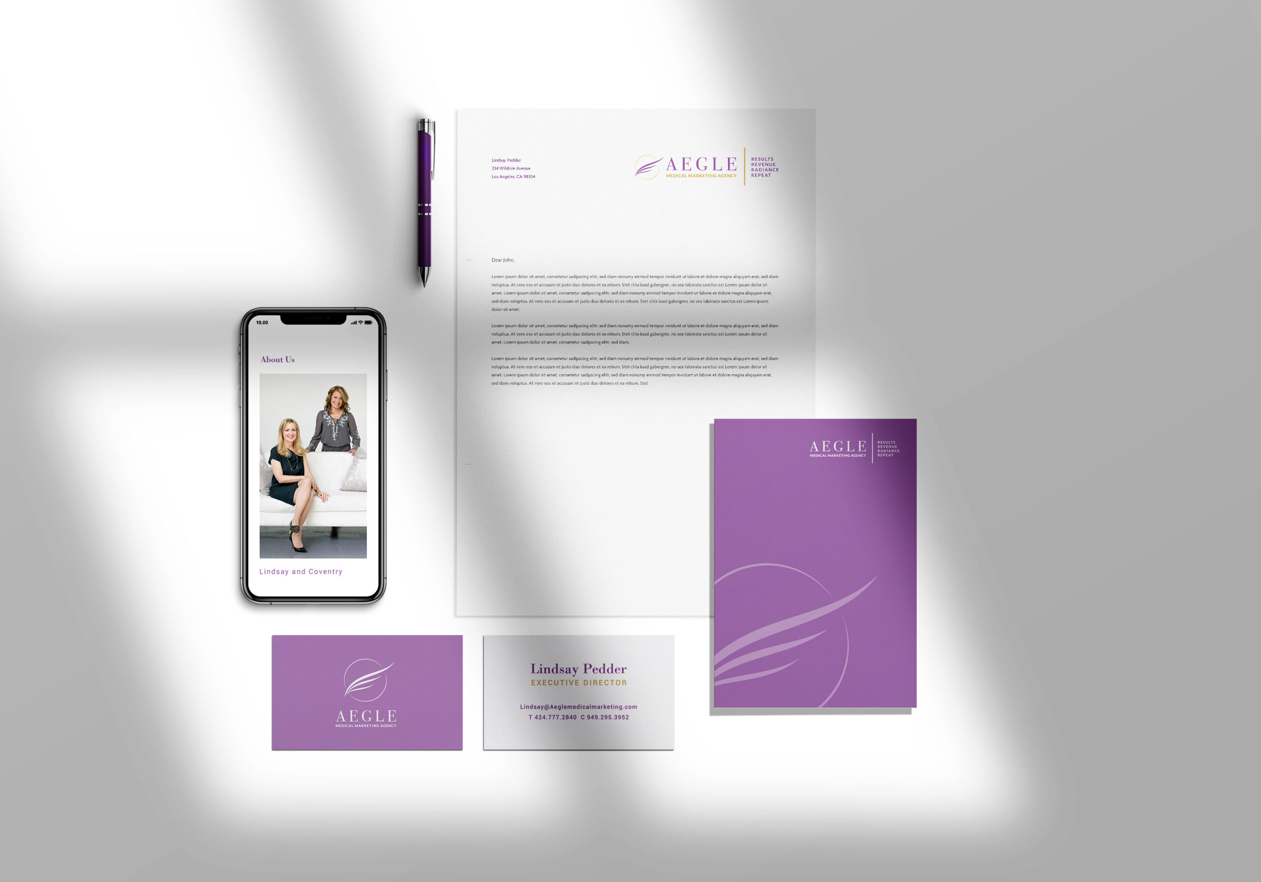
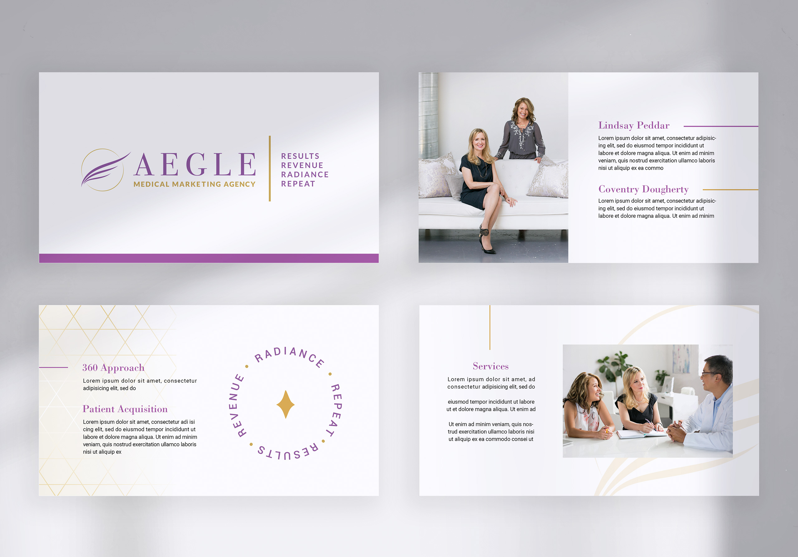
Lindsay and I had worked together previously for Obagi. When she started her new consulting agency with partner Coventry, she approached me to design the branding for Aegle Medical Marketing. The agency seeks to assist physicians in the beauty space with everything from marketing, patient acquisition to cross selling services. The brand’s vision is to embody femininity, beauty, elegance, and operational excellence.
Aegle’s name means “radiance” or “splendour” either from the beauty of the human body when in good health, or from the honor paid to the medical profession. In Greek mythology, Aegle is the daughter of Asclepius (a hero and god of medicine) and Epione (goddess of soothing).
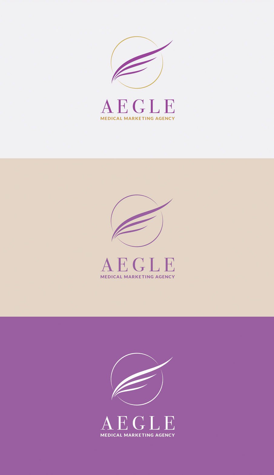
The circle around the wings in the logo symbolized radiance and the glow of beautiful, healthy skin. The wings are like those of a Greek goddess. Gold colors were used to represent operational excellence, and purple for femininity and a deluxe experience.


