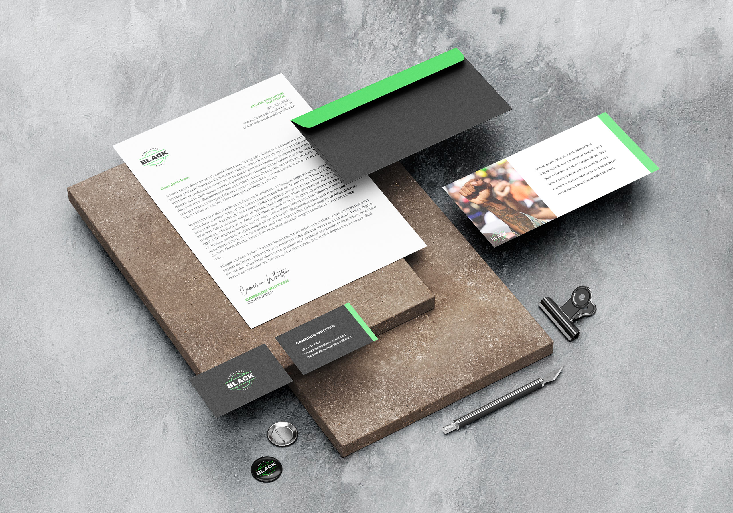
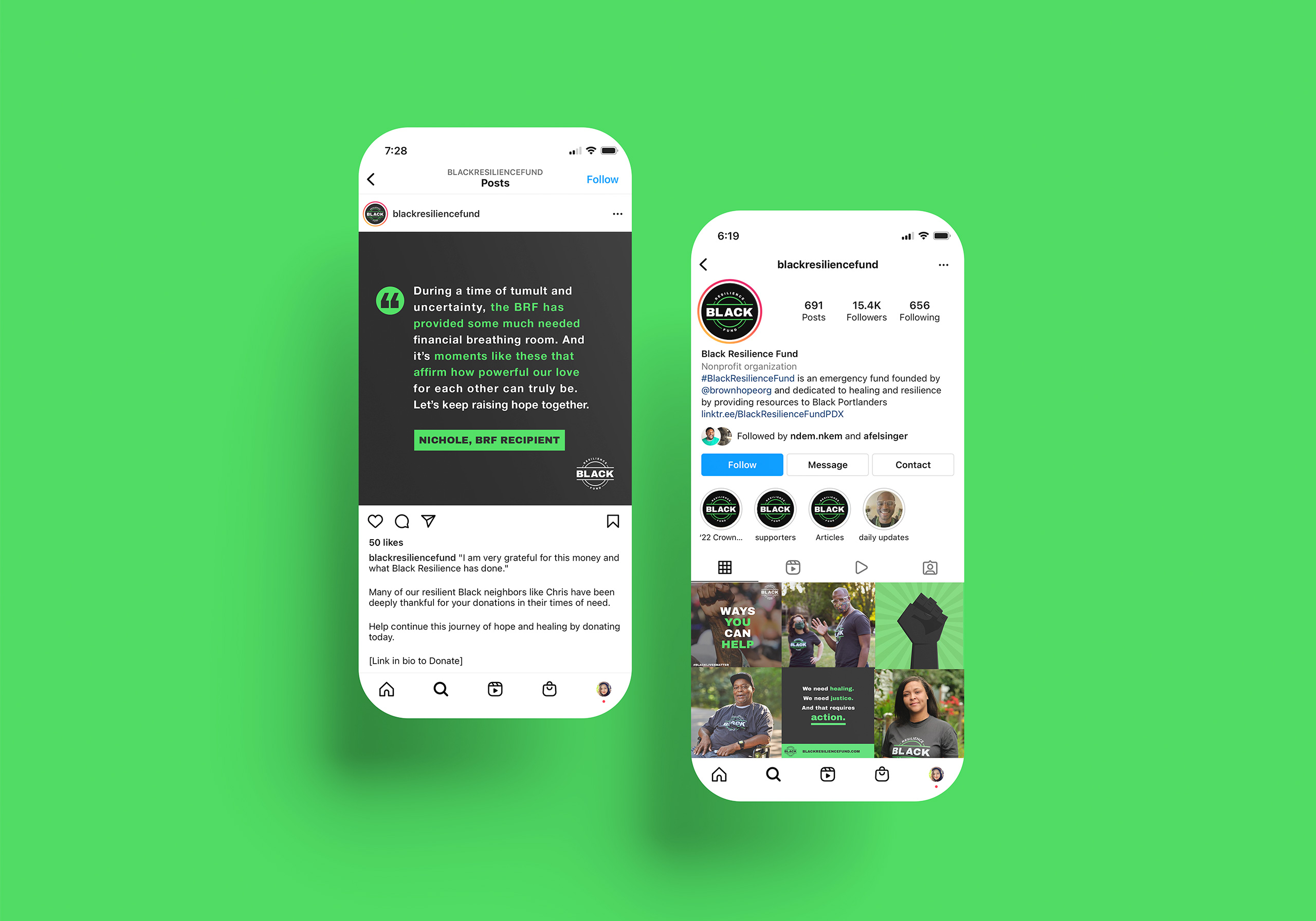
Black Resilience Fund is dedicated to fostering healing and resilience by providing immediate and direct financial assistance to Black Portlanders. The goal is to empower supporters with strong visuals to donate, promote, and contribute to the cause.
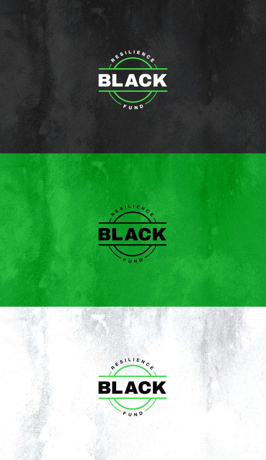
The logo centers the word “black”, representing black people, with “resilience fund” written in a circle to reference the funds encircling them, providing comfort and assistance. The round, double-lined shape is reminiscent of coins, and provides feelings of warmth, protection, and unity. Bold typefaces were used to convey strength against the fight for racial justice. Vibrant green, one of the primary colors, represents money and financial safety. It’s also a color associated with both healing and energy.
