Multicultural Veterinary Case Study
Role: Brand Development | Concept | Design
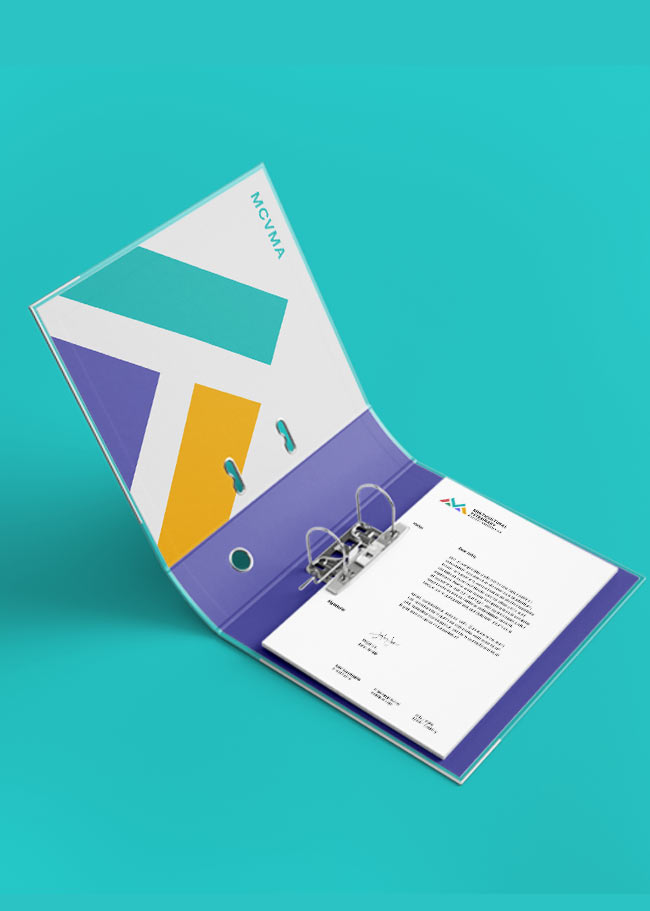
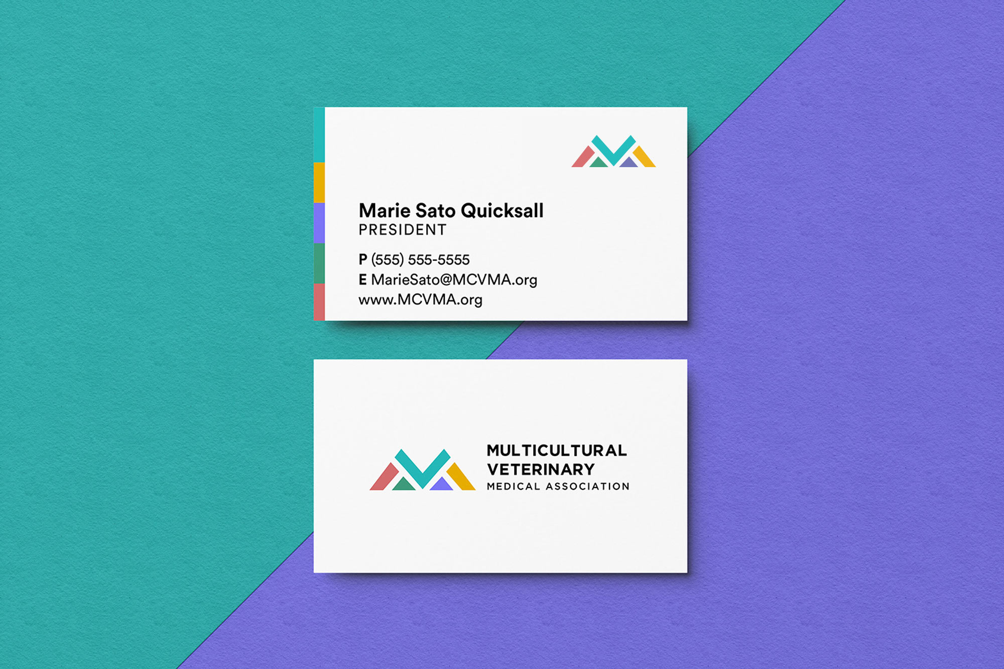
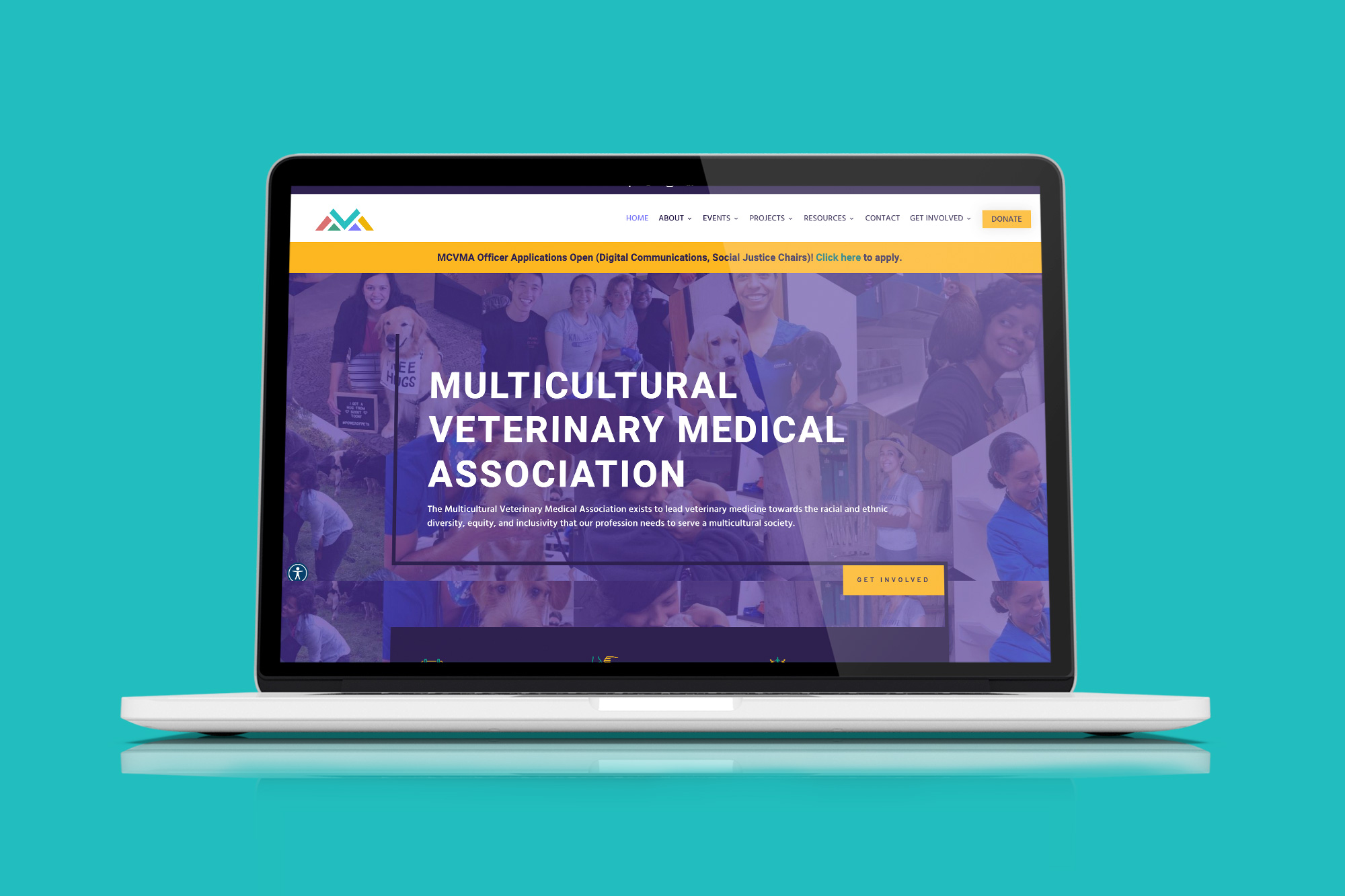
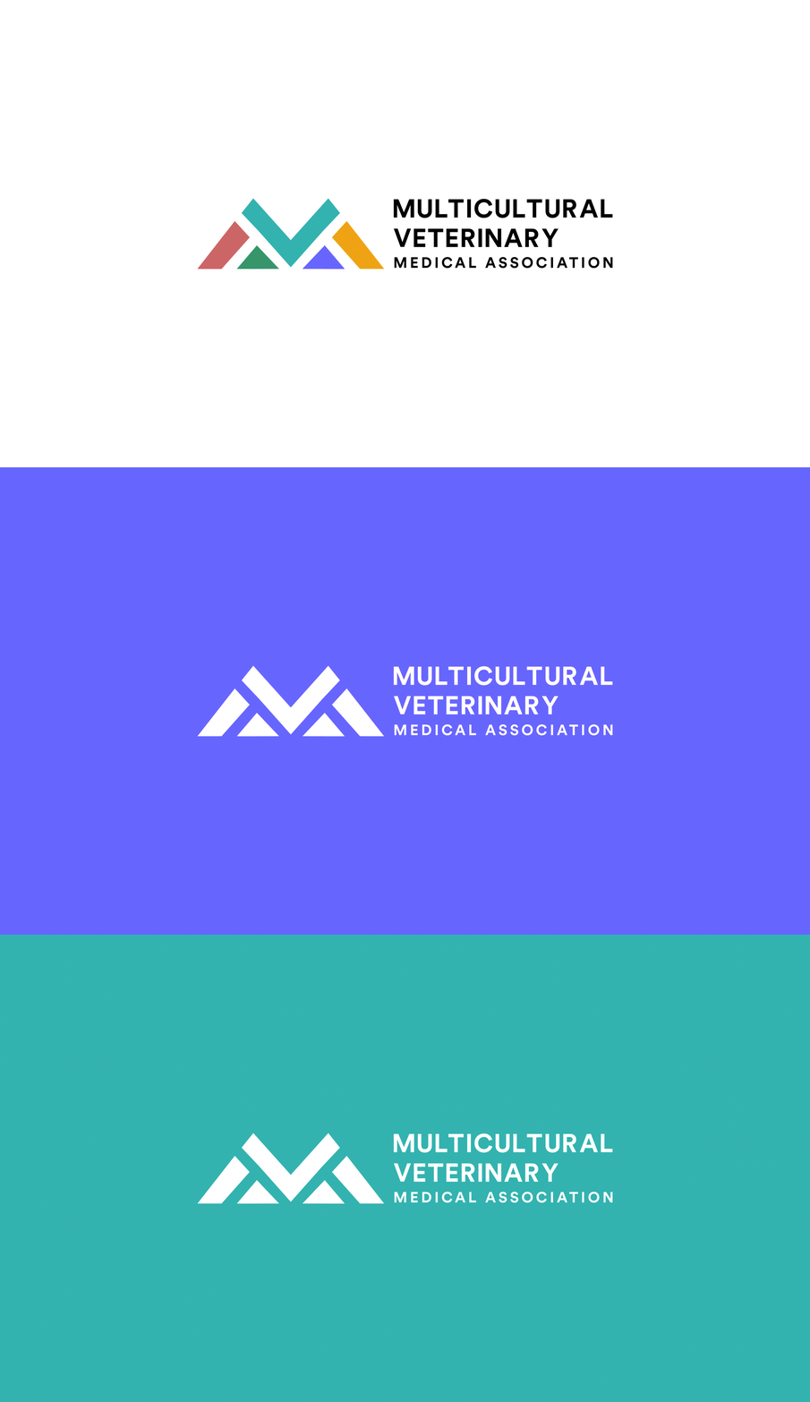
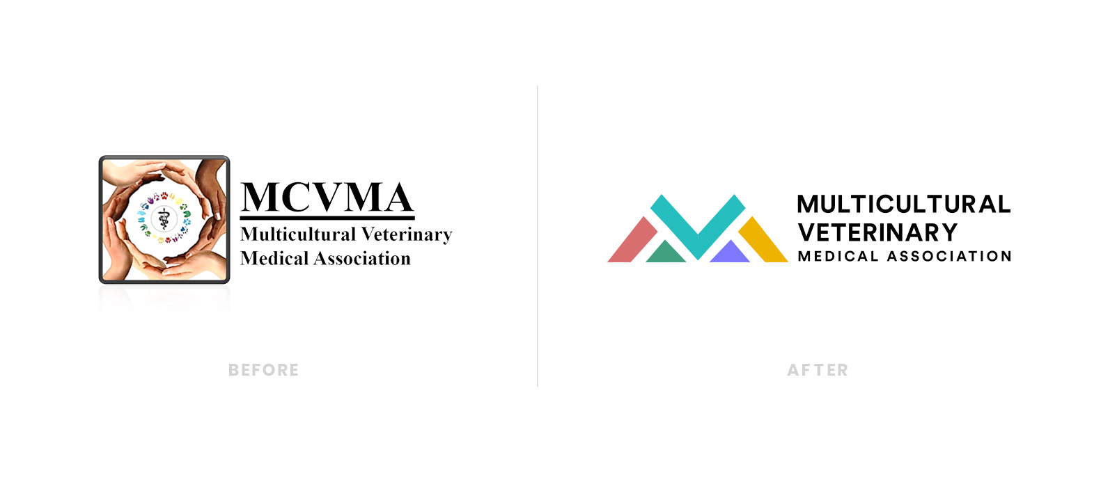
MCVMA’s vision is to transform the veterinary profession into one which is inclusive and equitable, where people of underrepresented races and ethnicities are valued and supported in their careers resulting in all communities receiving the benefits of veterinary medicine. MCVMA approached us for a rebrand of their visual identity. They wanted something professional, modern, progressive, and emphasizes on diversity in the veterinary field.
The meaning behind the mark

Brief
The founders of MCVMA started the organization with one mission – to address the diversity issue of the veterinary profession being 90% white. They needed the rebrand of their identity to reflect the progressive change towards a more inclusive veterinary field.
Challenge
MCVMA’s challenge was a lack of a strong and consistent brand presence that could speak to the important work they do for the veterinary field. Without a brand that could position them apart from many other similar veterinary medical associations, they lacked a strong positioning resulting in supporters not being able to easily identify their core mission, which is to address the diversity issue in the veterinary field.
Solution
A discovery meeting was held with various team members of the organization to discuss their visions and goals for the rebrand. However, reaching a unanimous decision among the team members proved to be a challenge due to the diverse opinions regarding the focal points of the logo. Some preferred maintaining elements of the old logo, while others sought a complete overhaul
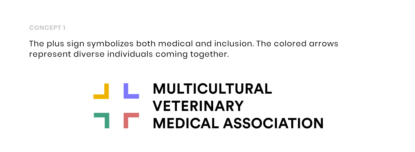
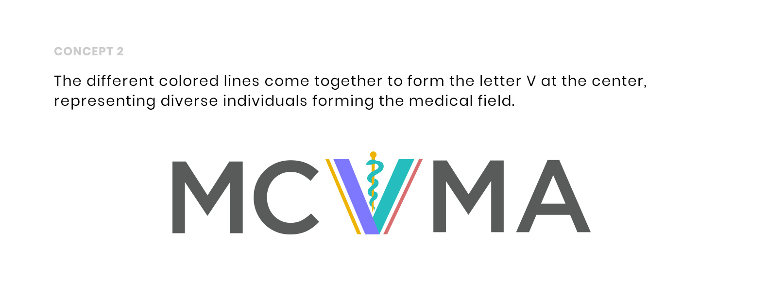
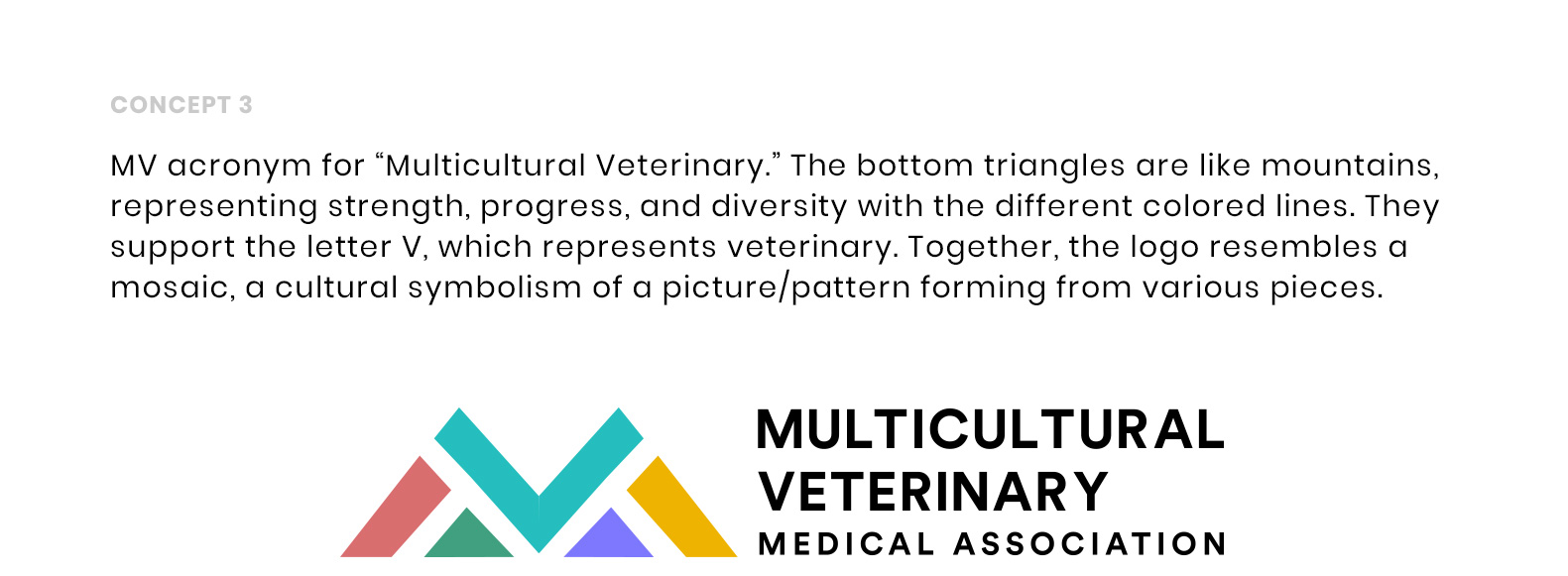
To address this, an additional team meeting was organized to generate ideas and concepts. Eventually, the client agreed that the primary objective was to convey diversity in the medical field, with an added emphasis on progress. I proposed a concept that wasn’t previously discussed, emphasizing on their acronym MV, which would set the logo apart from other similar brands. With more clarity now, I presented three concepts with descriptions and visuals. After the team review, they came to a consensus that concept 3 was the most successful in depicting their vision.
Impact
MCVMA debutted their new logo with resounding success on social media with many supporters claiming they love both the visual and the meaning behind the logo. MCVMA also saw a dramatic increase in donations after the rebrand.
The logo amongst similar brands


Expanded CIrcle Collective
Role: Art Direction | Branding | Concept | Design
Animator: Thomas Van Den Heuvel
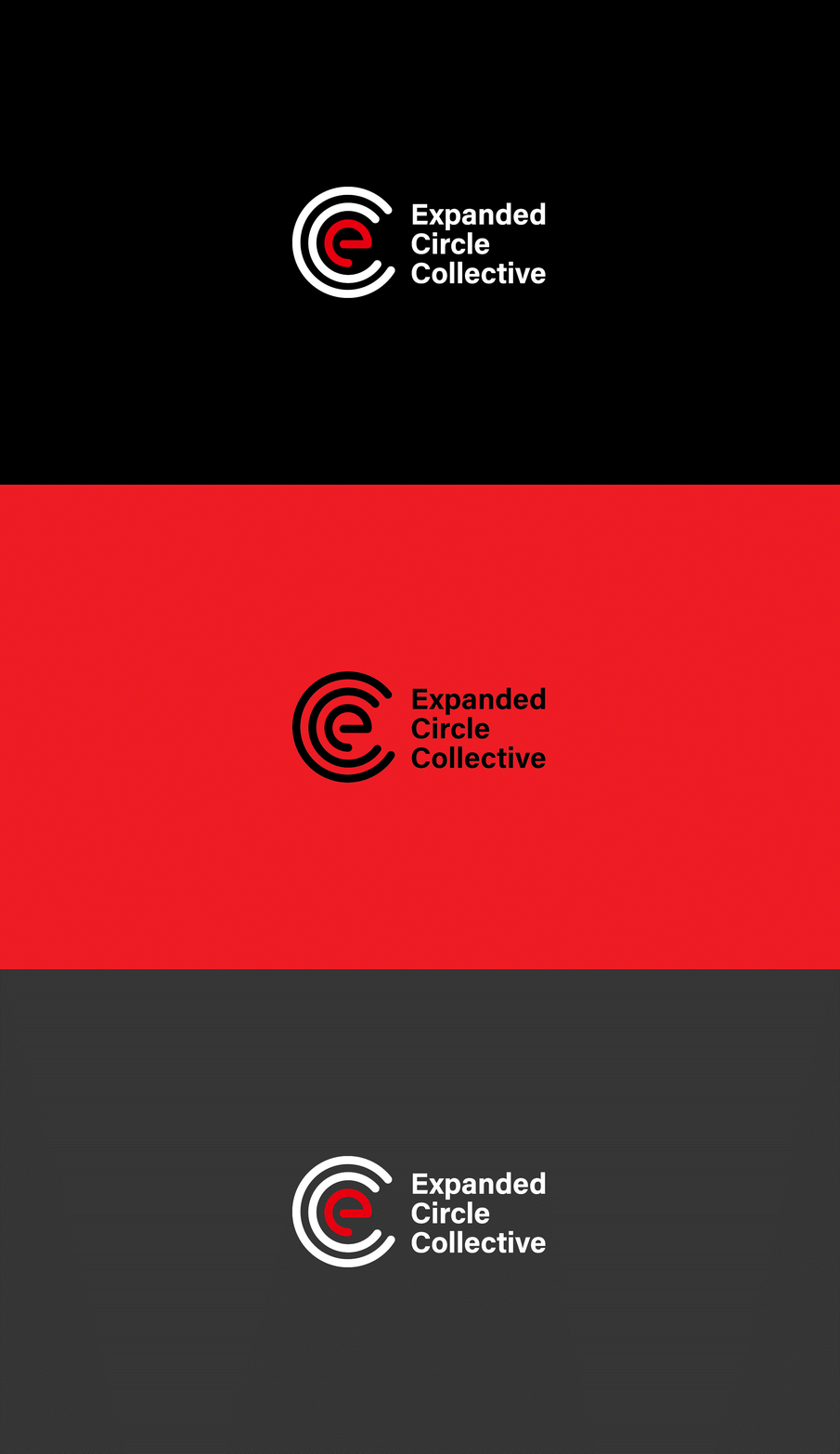
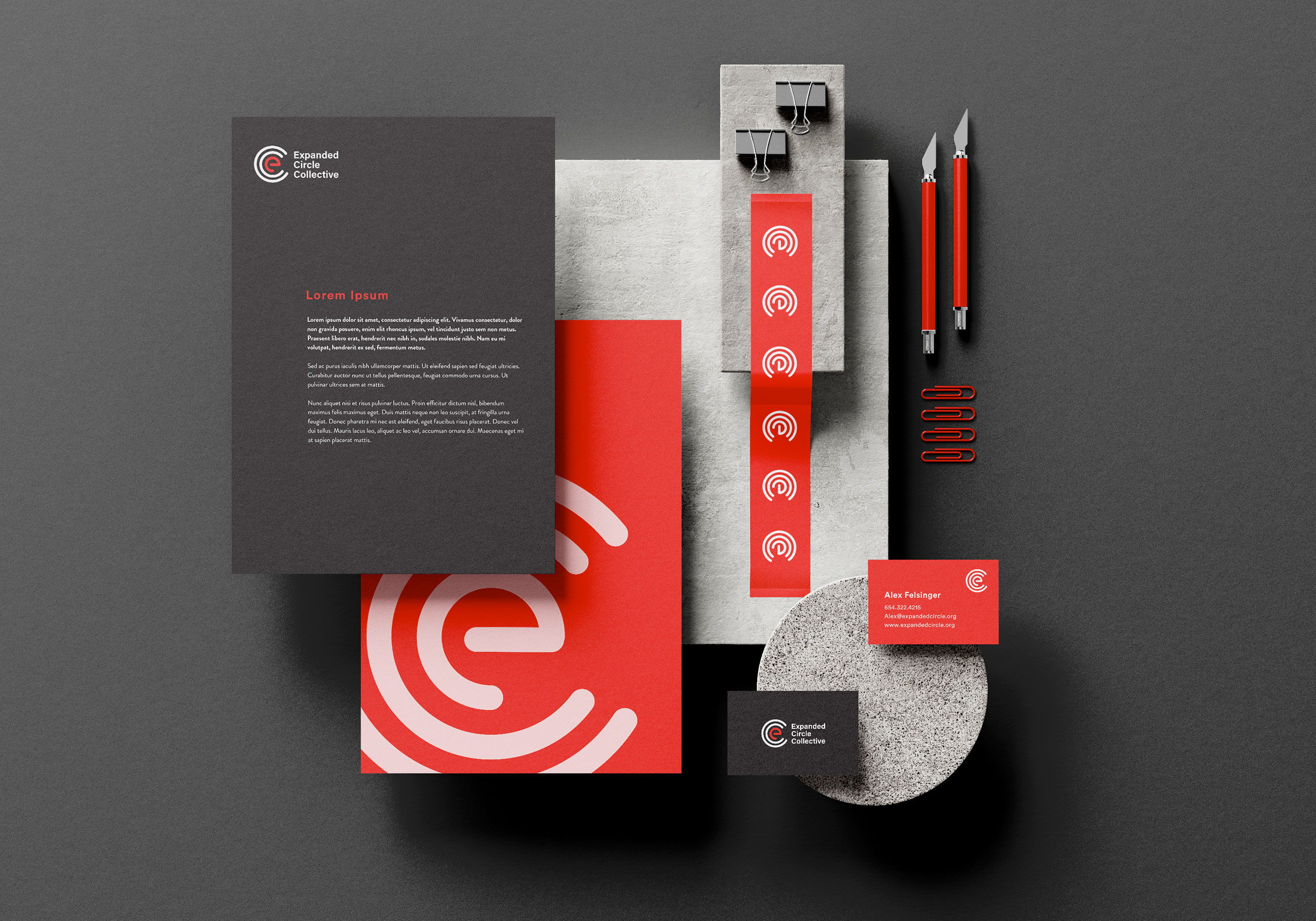
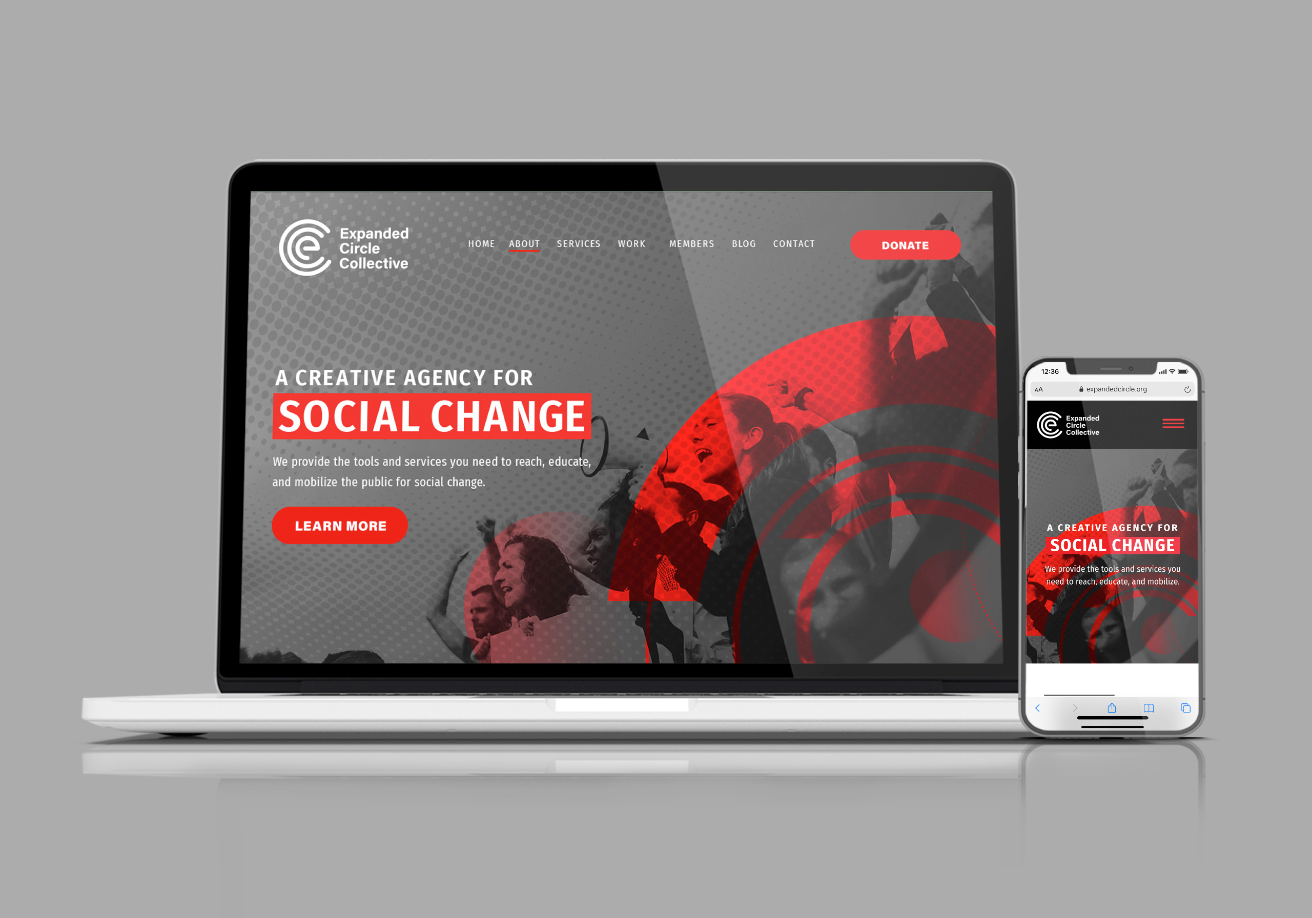
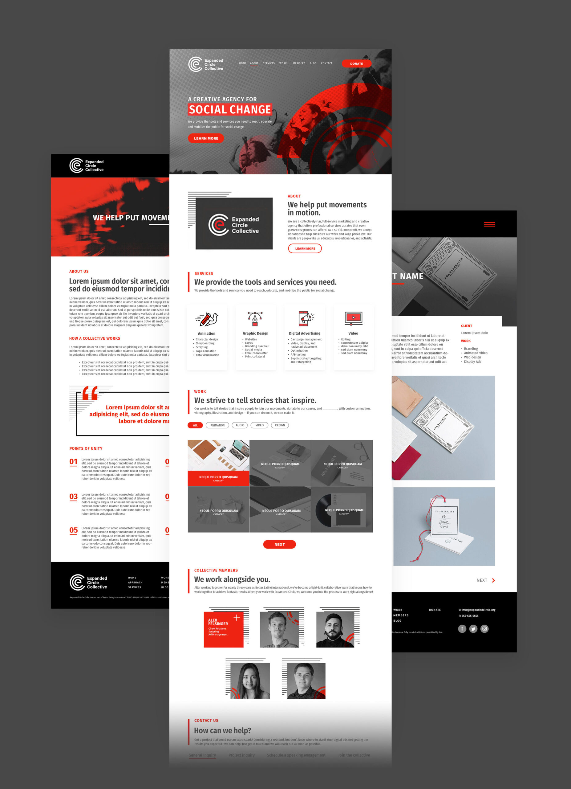
Any nonprofit organization that wants to thrive needs excellent marketing and engaging visual content. That’s where Expanded Circle Collective steps in offering creative solutions to small grassroots nonprofits that otherwise couldn’t afford the large expense of a branding overhaul. As the Lead Designer, I was tasked with creating our brand. Our strategy was to appeal to activists, the name “Expanded Circle” meant expanding outreach efforts through impactful branding. The two Cs in the logo widen and enlarge like expanding circles. The use of red and black evoke feelings of importance, passion, and aggressiveness in activism work. I also chose a modernized version of the Swiss style for its emphasis on simplicity and purpose where “form follows function.” Something we strive to achieve in our work.
Our Honor
Role: Brand Development | Concept | Design
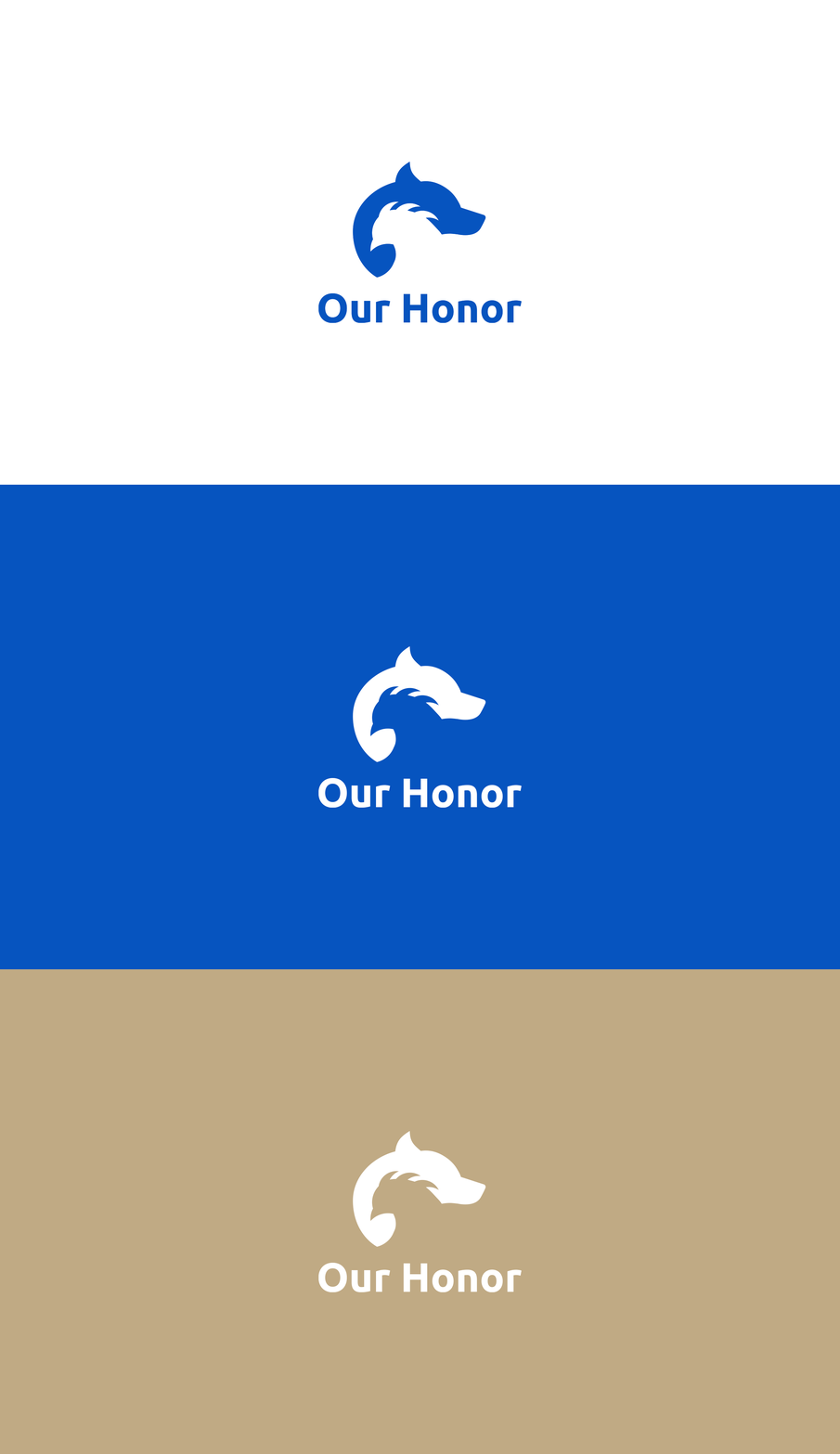
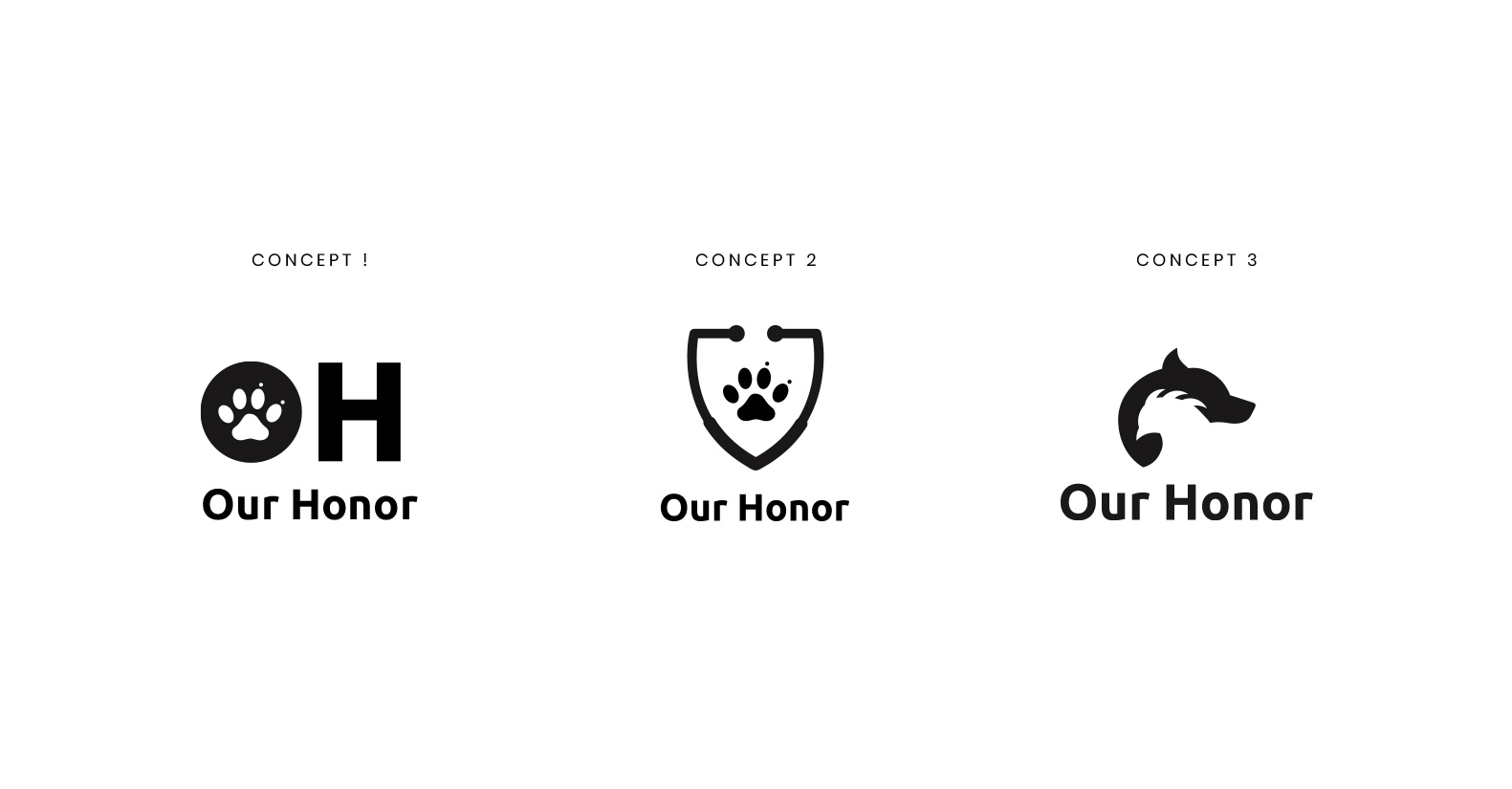
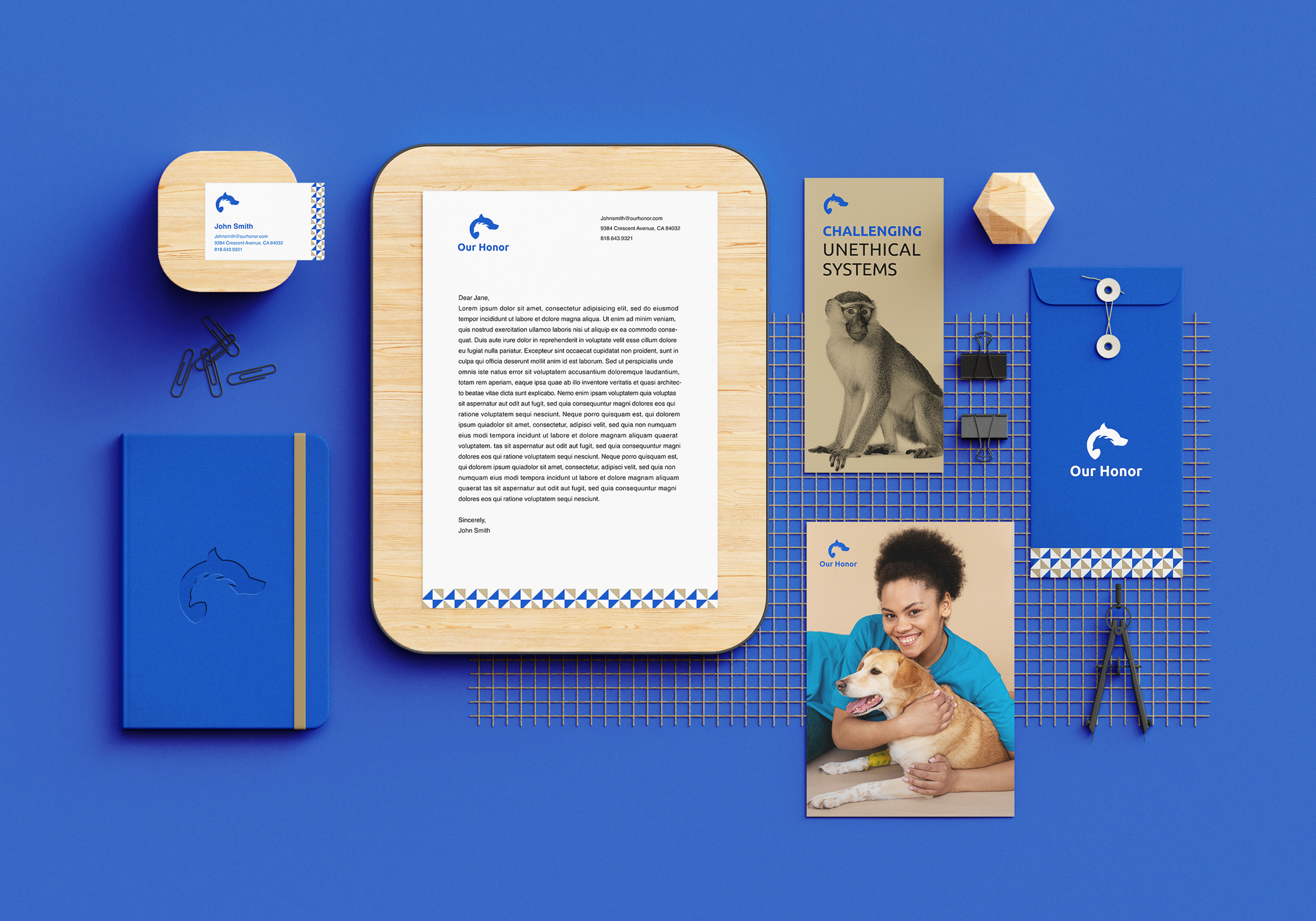
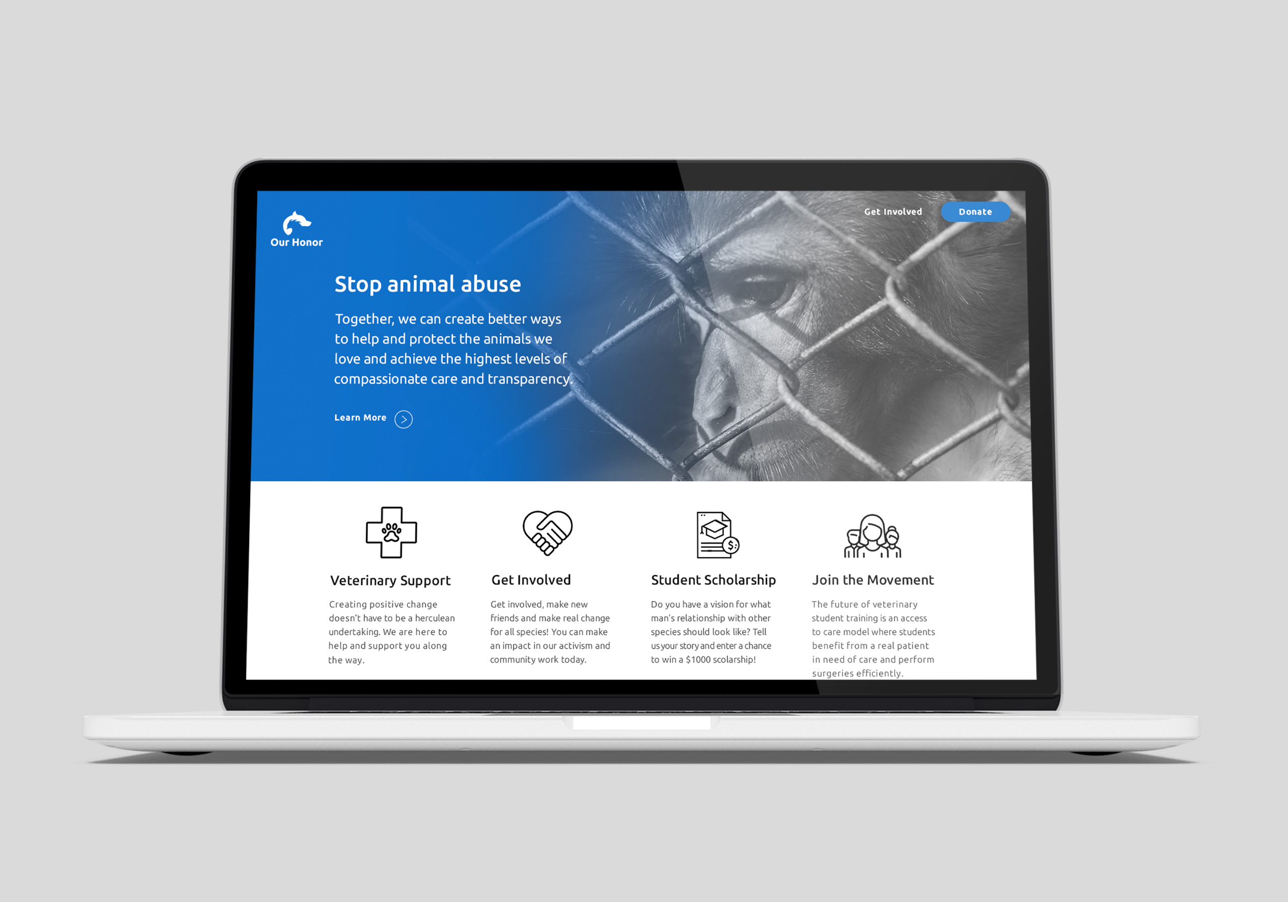
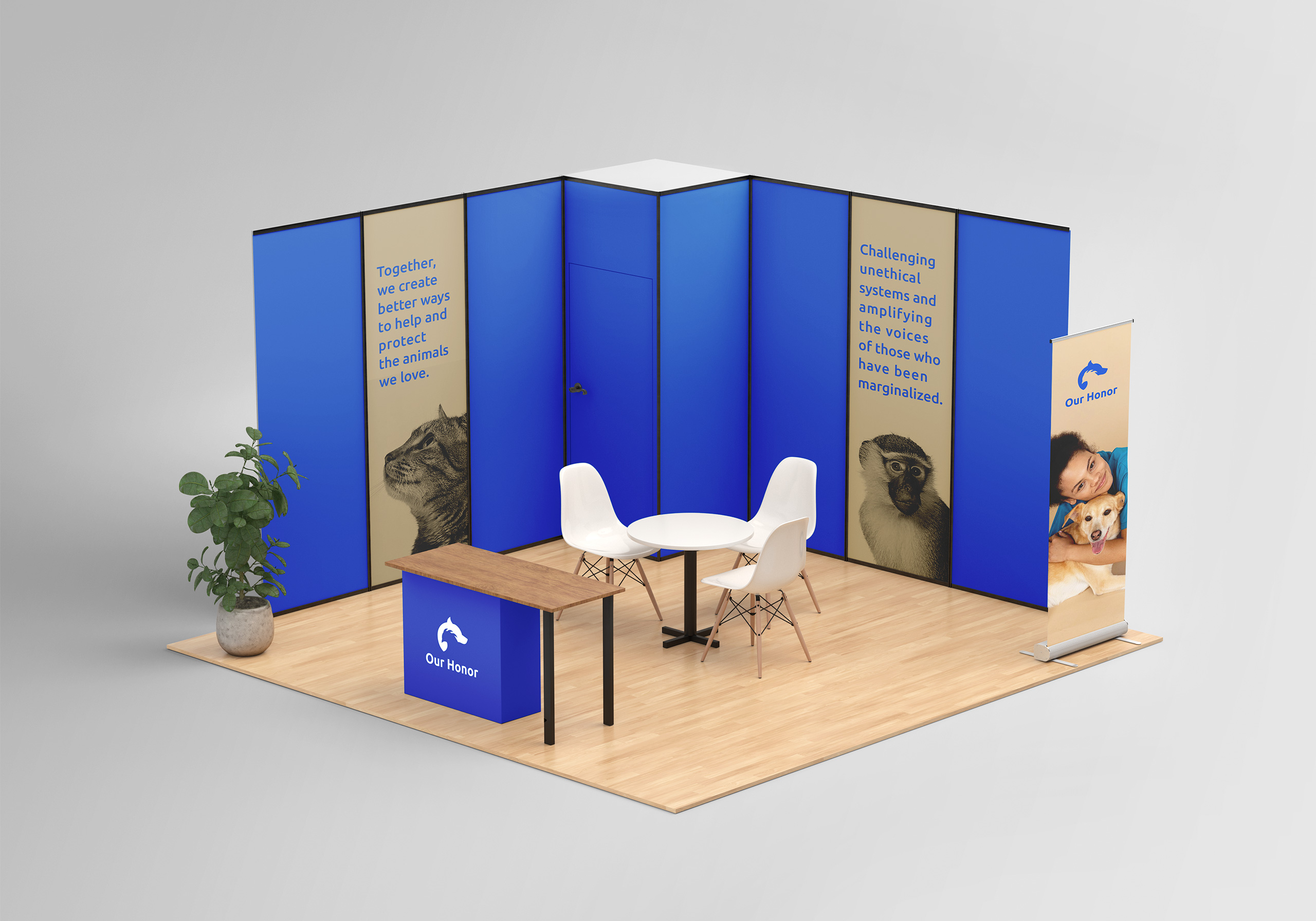
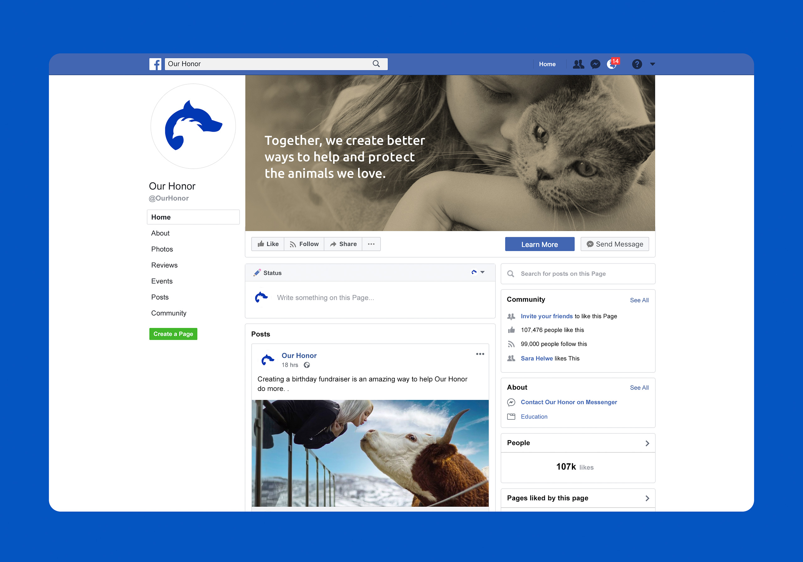
Our Honor is a nonprofit veterinary organization that aims to create an organized network of professionals to challenge unethical institutionalized systems and amplify the voices of those who have been marginalized. The concept for the logo conveys Our Honor’s mission to forge alliances with industry to help protect both pets and test animals. The two forms merge into one as one mission.

Aegle Medical
Marketing
Agency
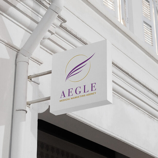
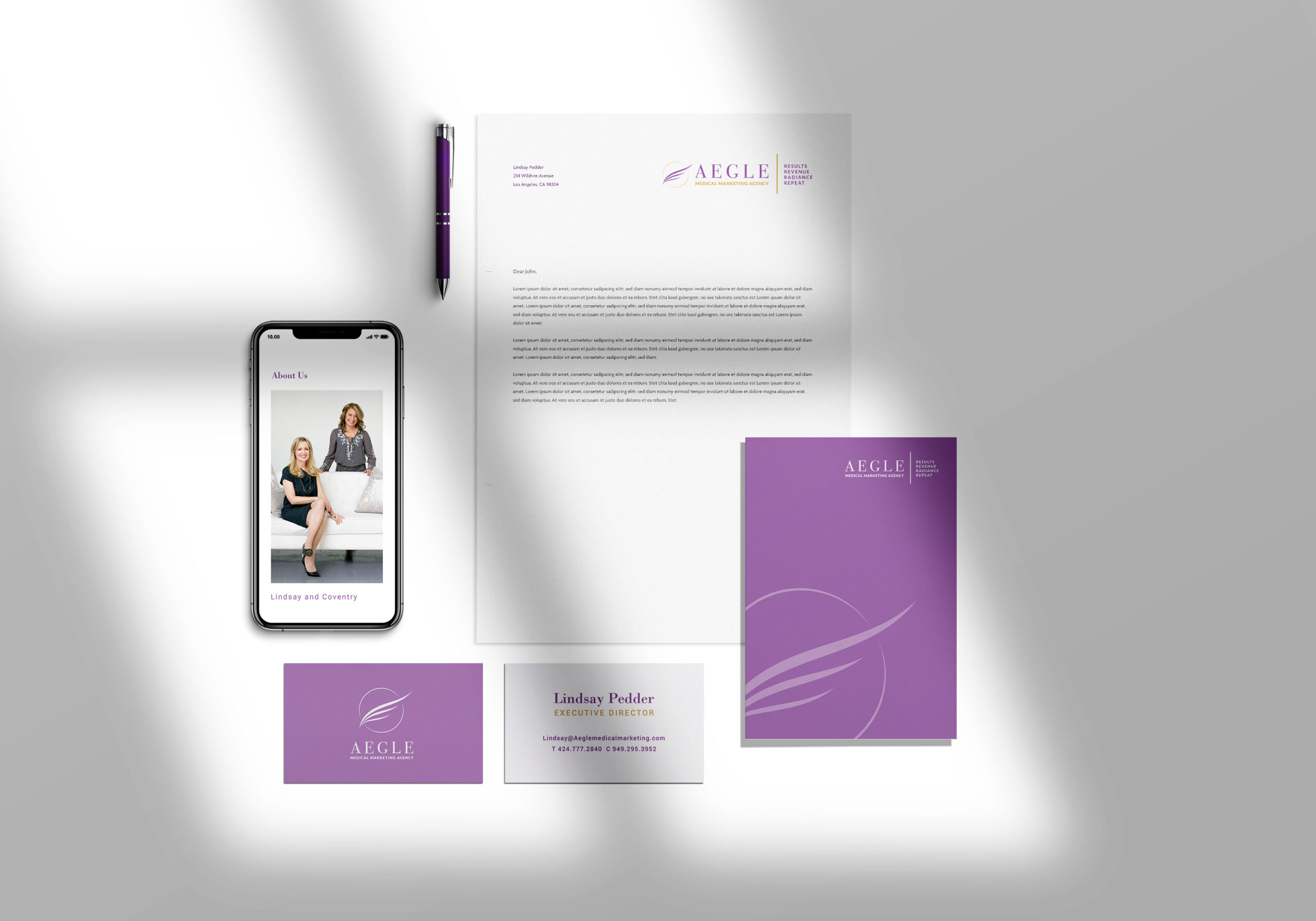
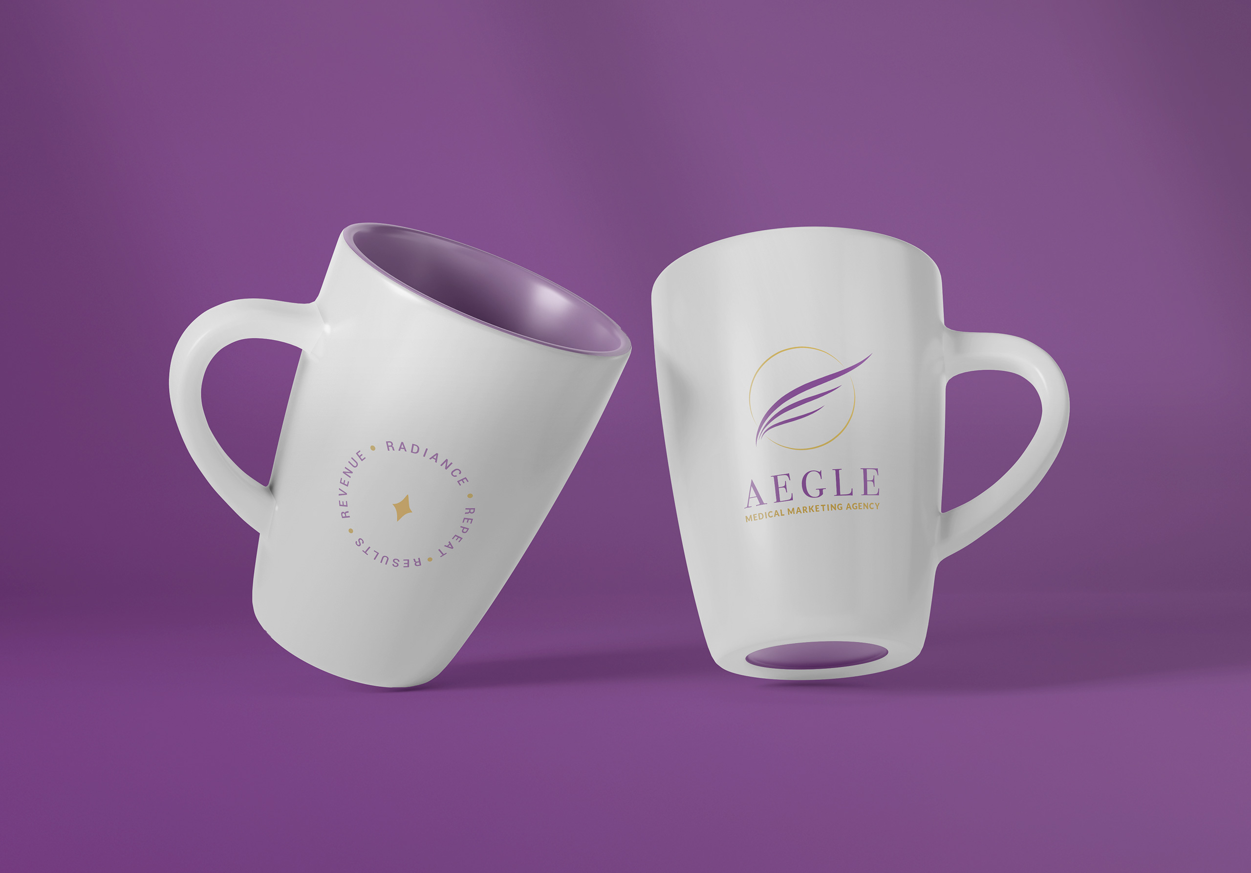
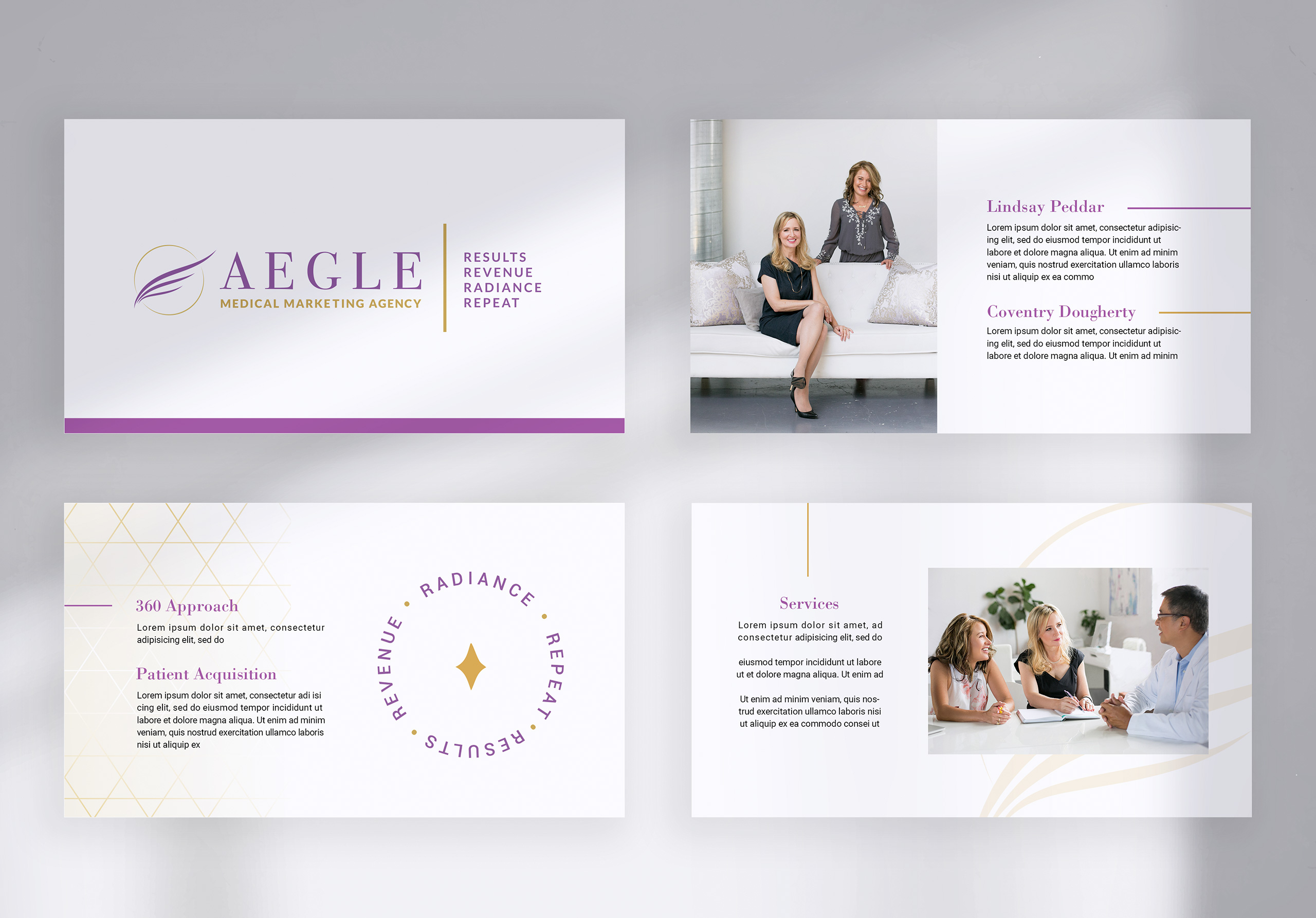
Lindsay and I had worked together previously for Obagi. When she started her new consulting agency with partner Coventry, she approached me to design the branding for Aegle Medical Marketing. The agency seeks to assist physicians in the beauty space with everything from marketing, patient acquisition to cross selling services. The brand’s vision is to embody femininity, beauty, elegance, and operational excellence.
Aegle’s name means “radiance” or “splendour” either from the beauty of the human body when in good health, or from the honor paid to the medical profession. In Greek mythology, Aegle is the daughter of Asclepius (a hero and god of medicine) and Epione (goddess of soothing).
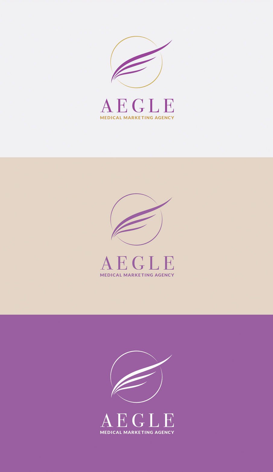
The circle around the wings in the logo symbolized radiance and the glow of beautiful, healthy skin. The wings are like those of a Greek goddess. Gold colors were used to represent operational excellence, and purple for femininity and a deluxe experience.

Asha Farm Sanctuary
Role: Branding | Concept | Design | Illustration
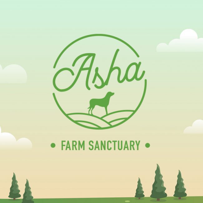
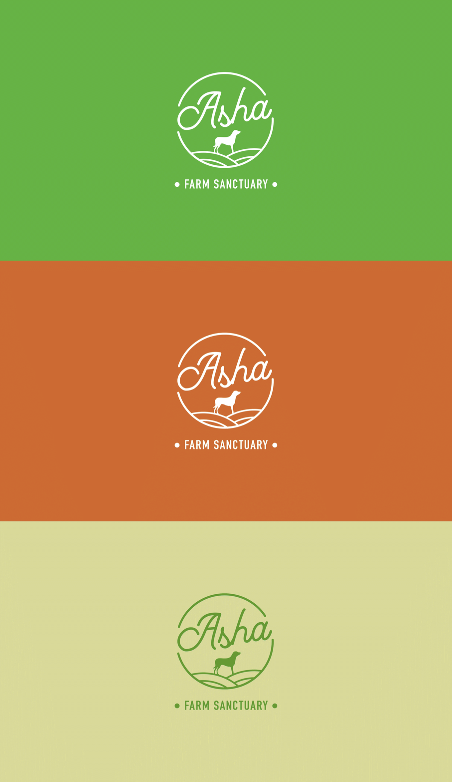
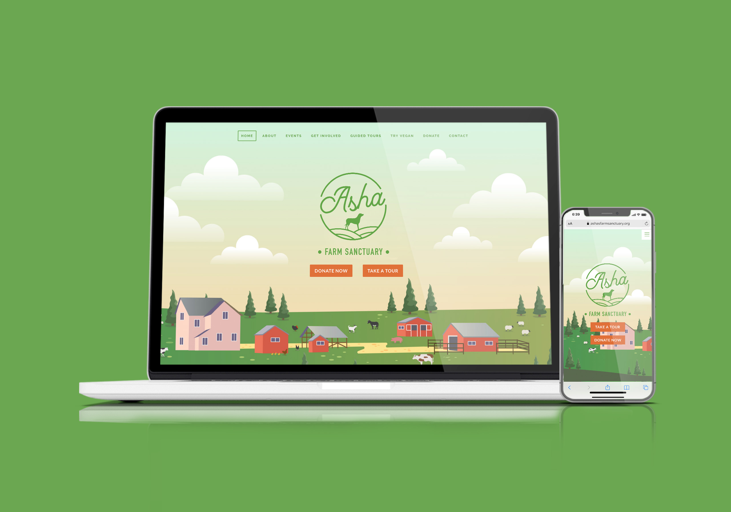
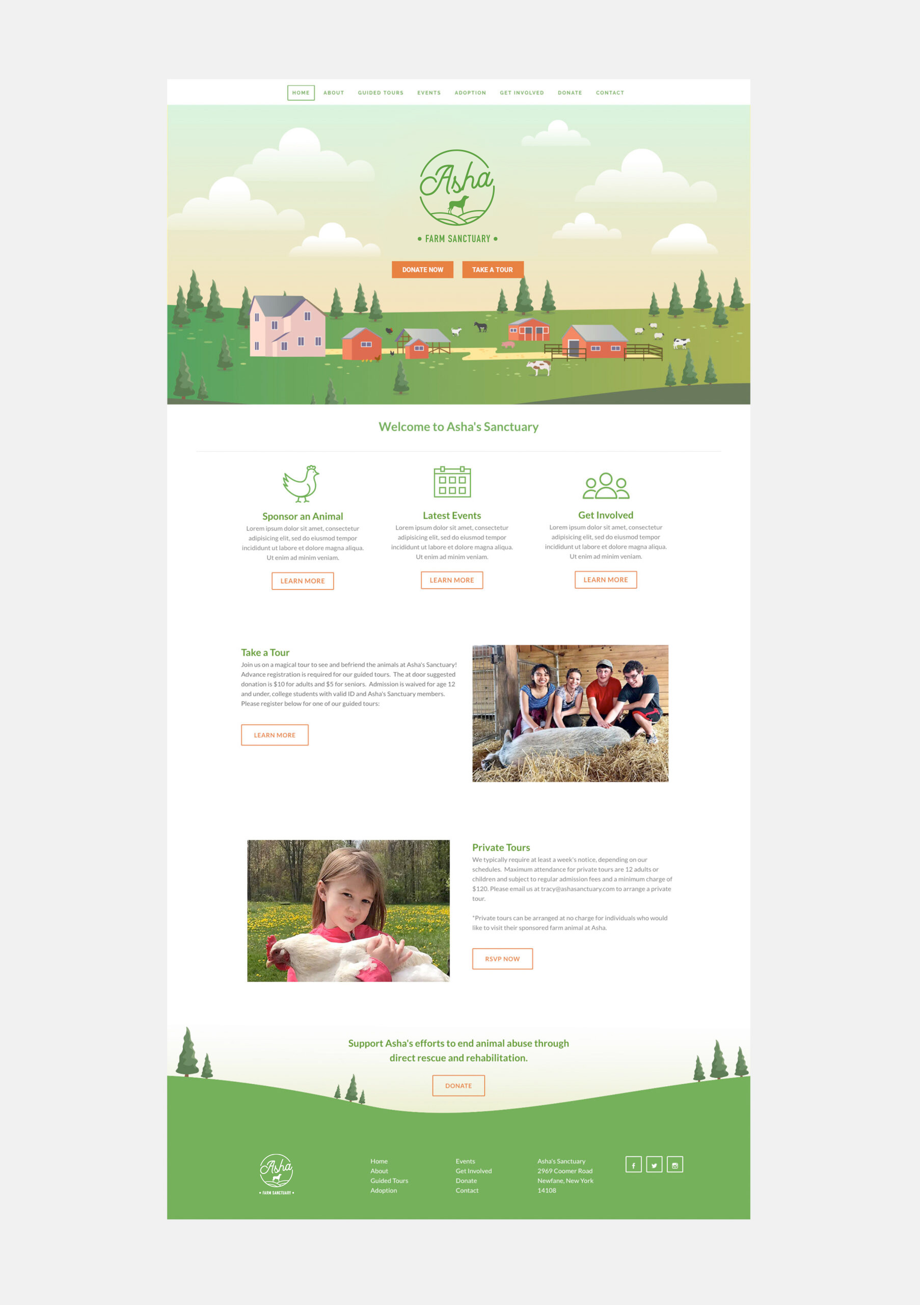
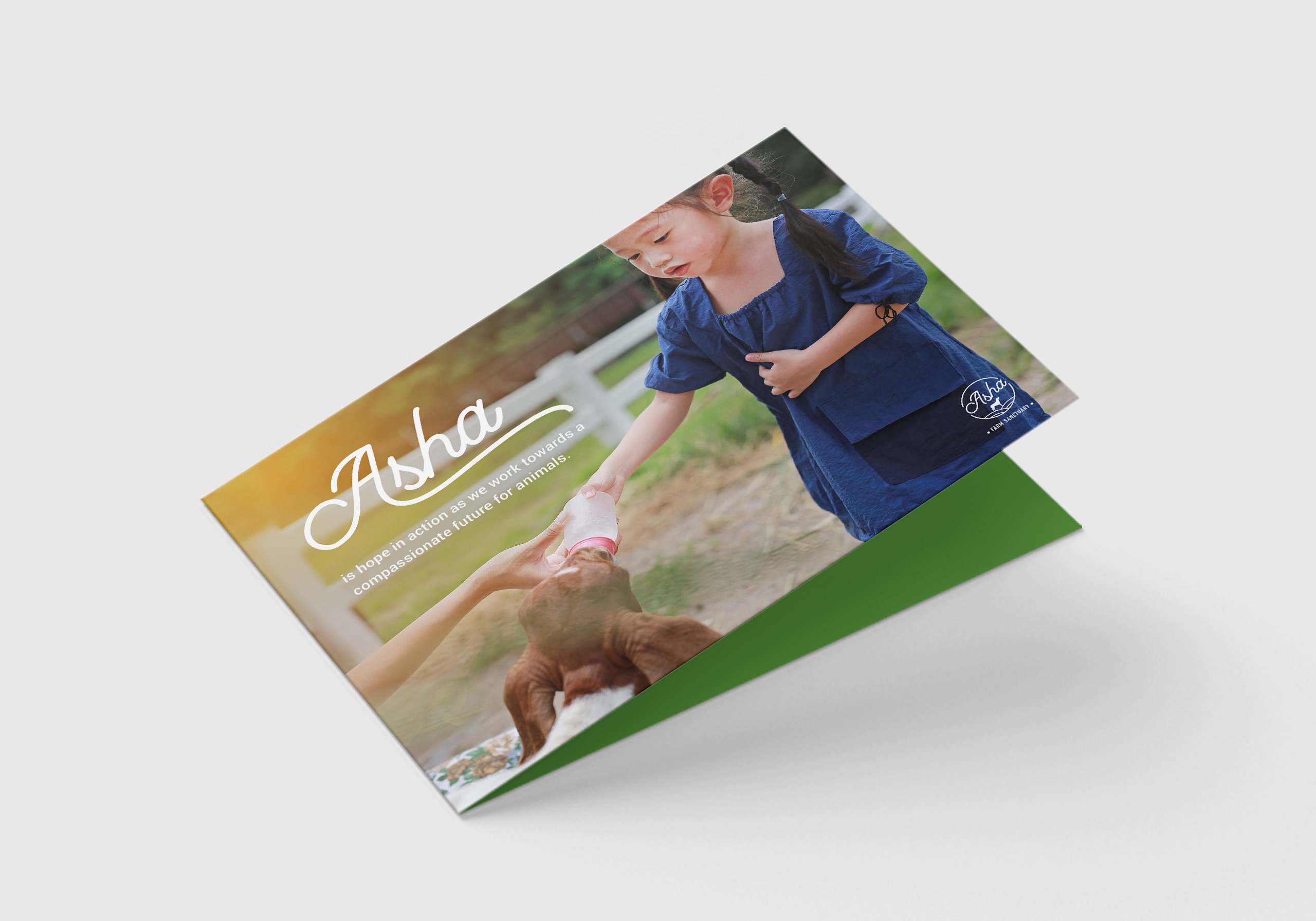
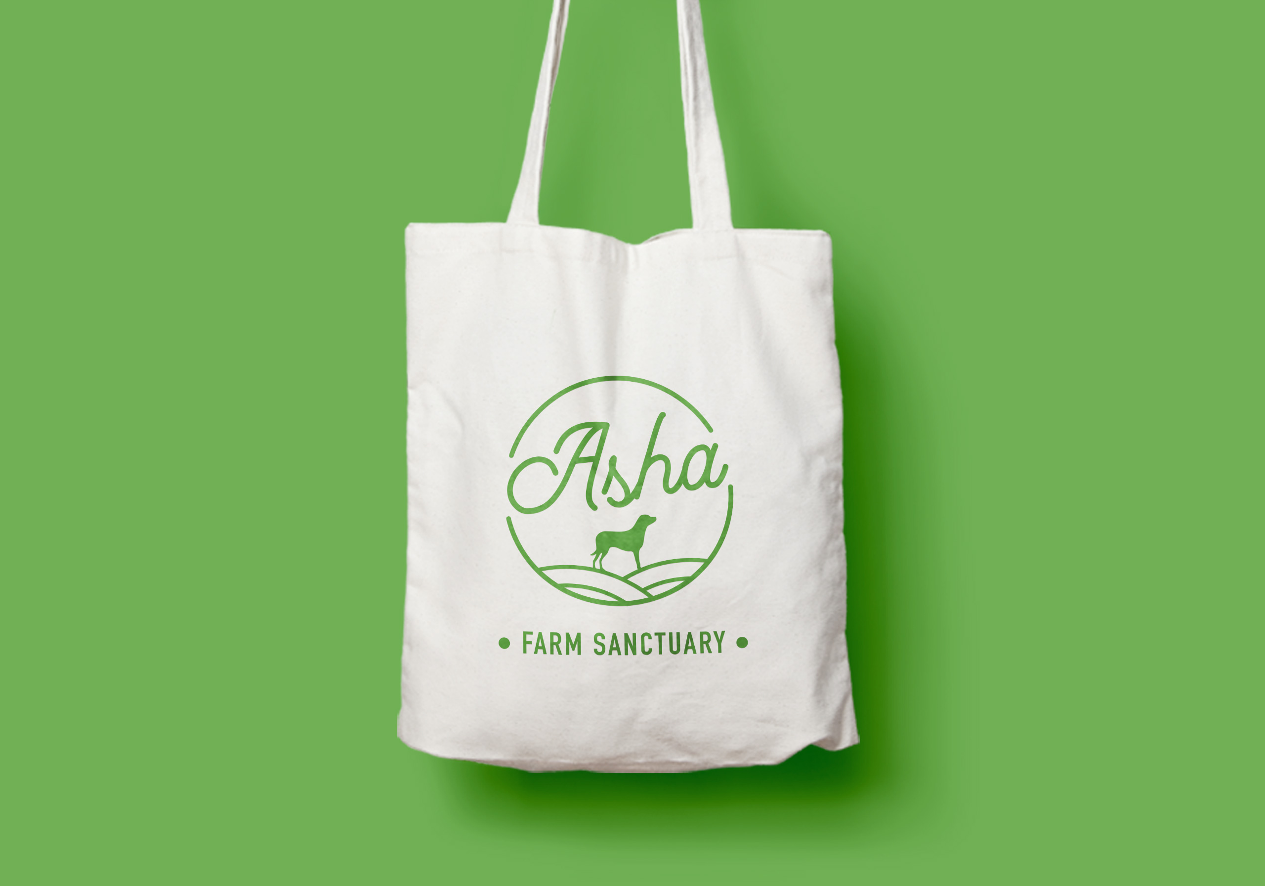
“Asha is hope in action as we work towards a compassionate future for animals.” Asha Farm Sanctuary was formed after our client’s dog, Asha, passed away. The loss inspired her to make a difference in animals’ lives, and give others a chance to make a connection between pets and farmed animals. Our client sought to give an inviting experience to families with young kids as they would be participating in many activities on the farm.
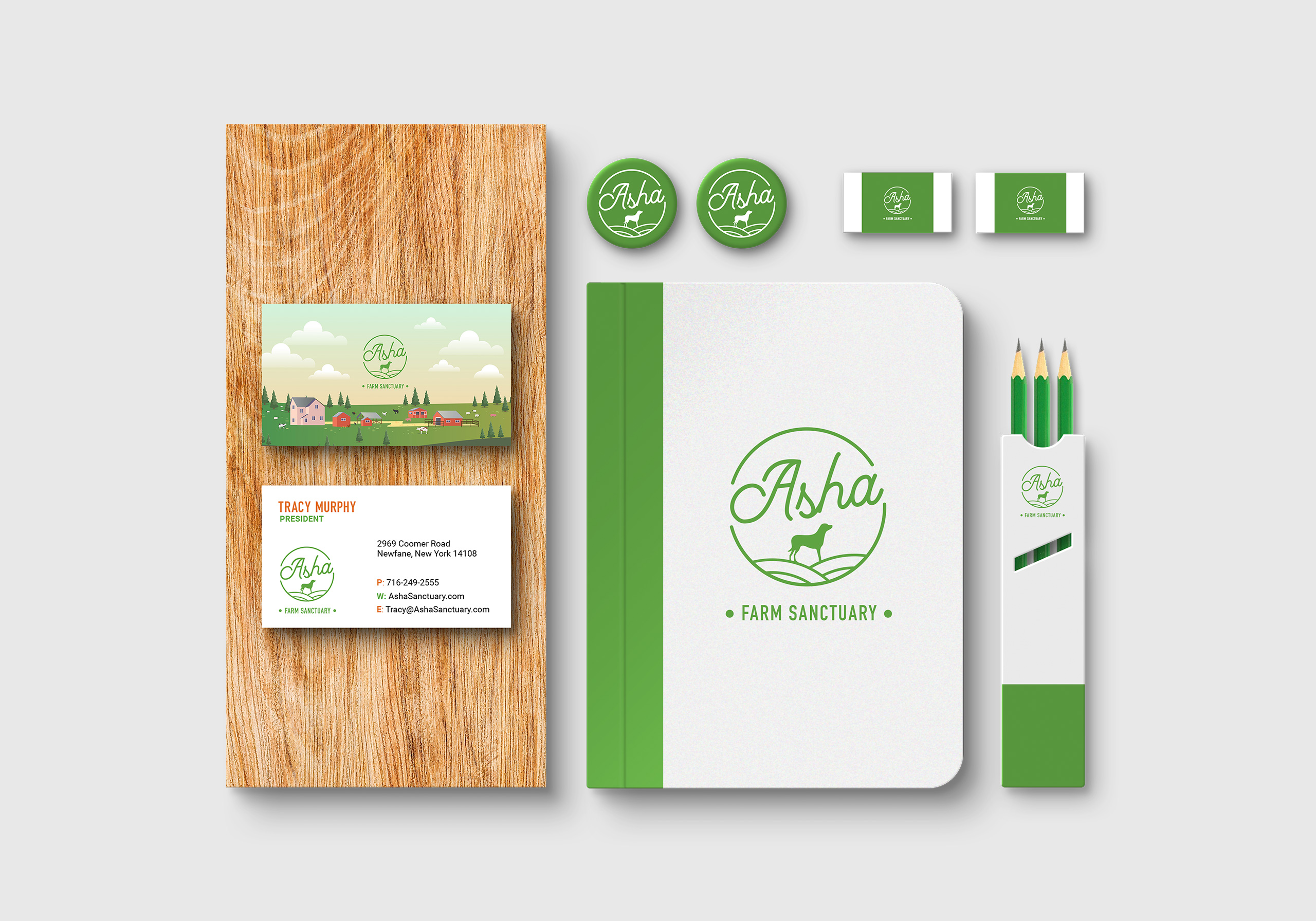
Our goal was to appeal to children with a storybook feel that is intimate, warm, and family-oriented. I redesigned the logo, illustrated the hero image referencing the real sanctuary, designed the stationery, and built the website on Weebly as that was the preferred platform the client had familiarity with.

Black Resilience Fund
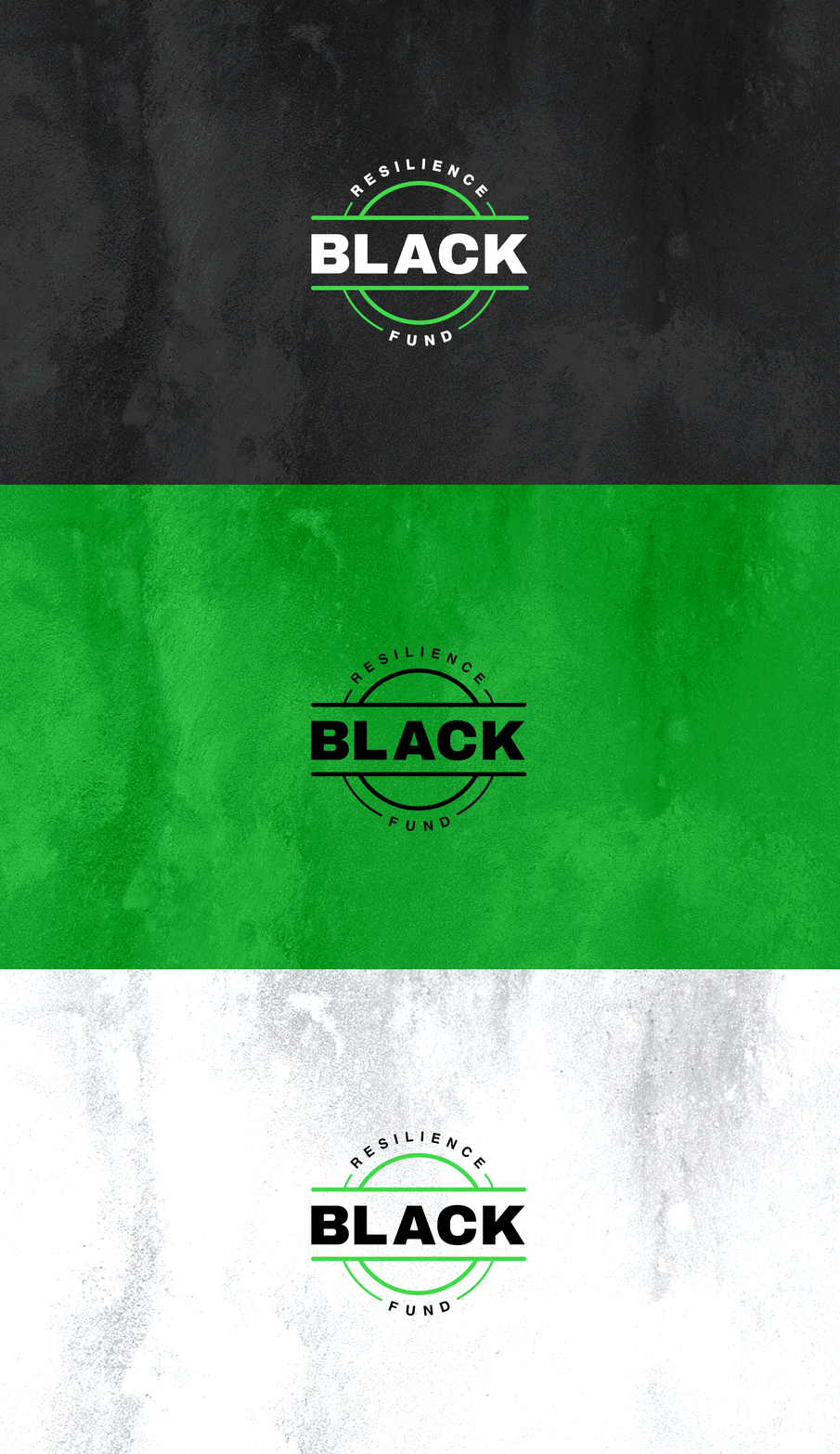
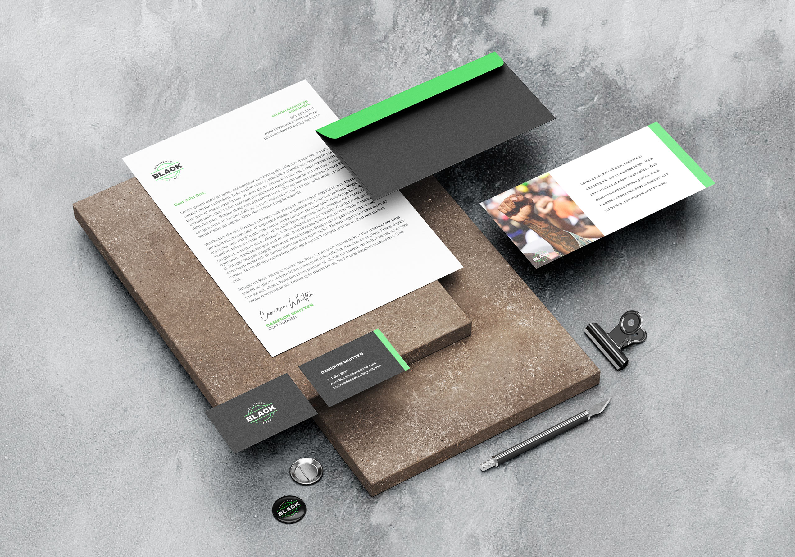
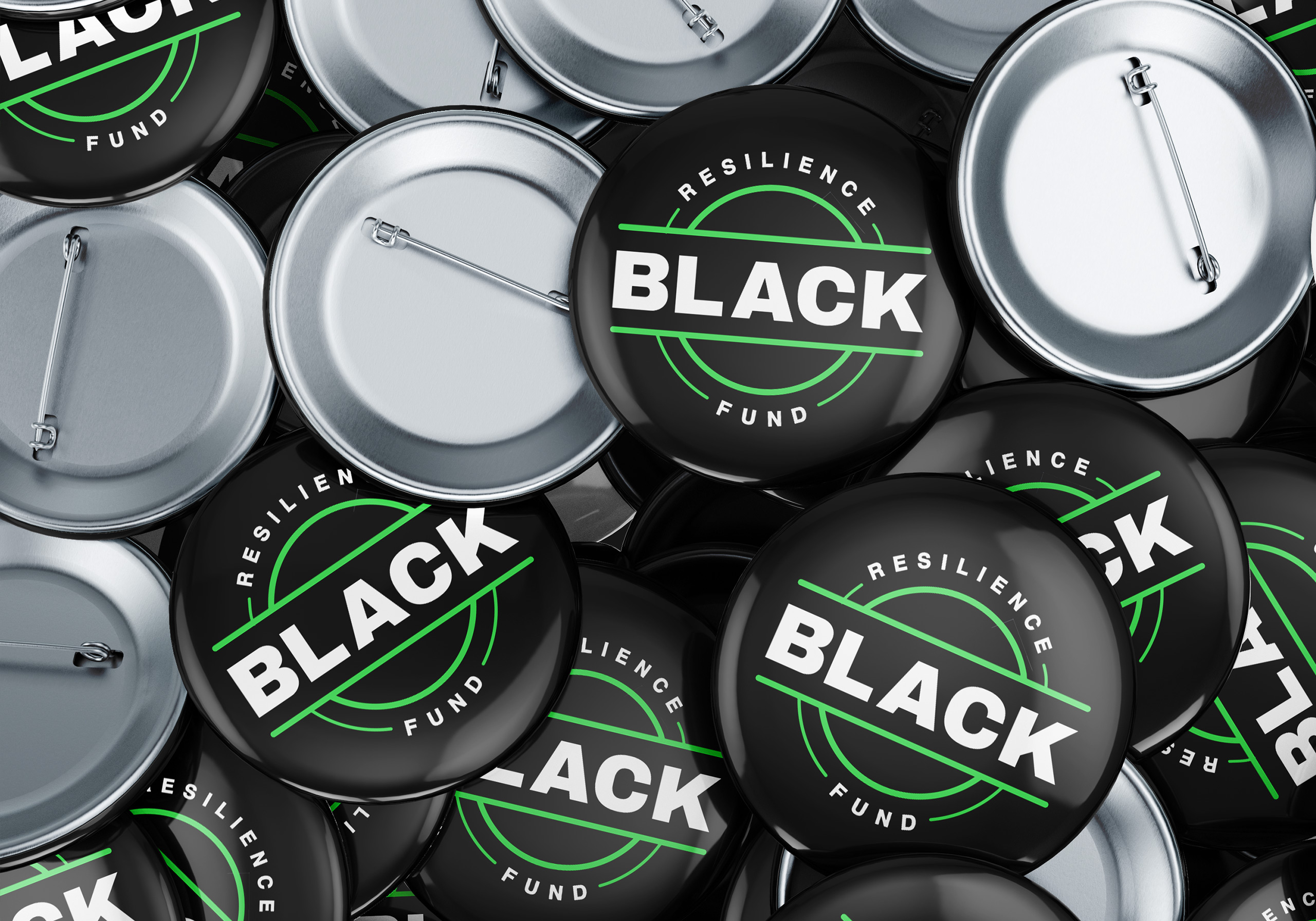
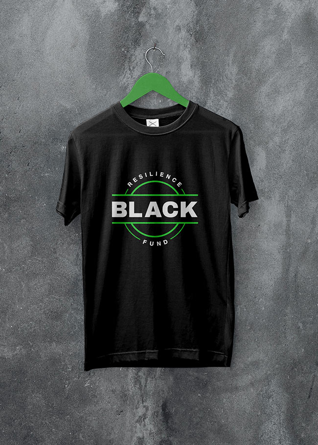
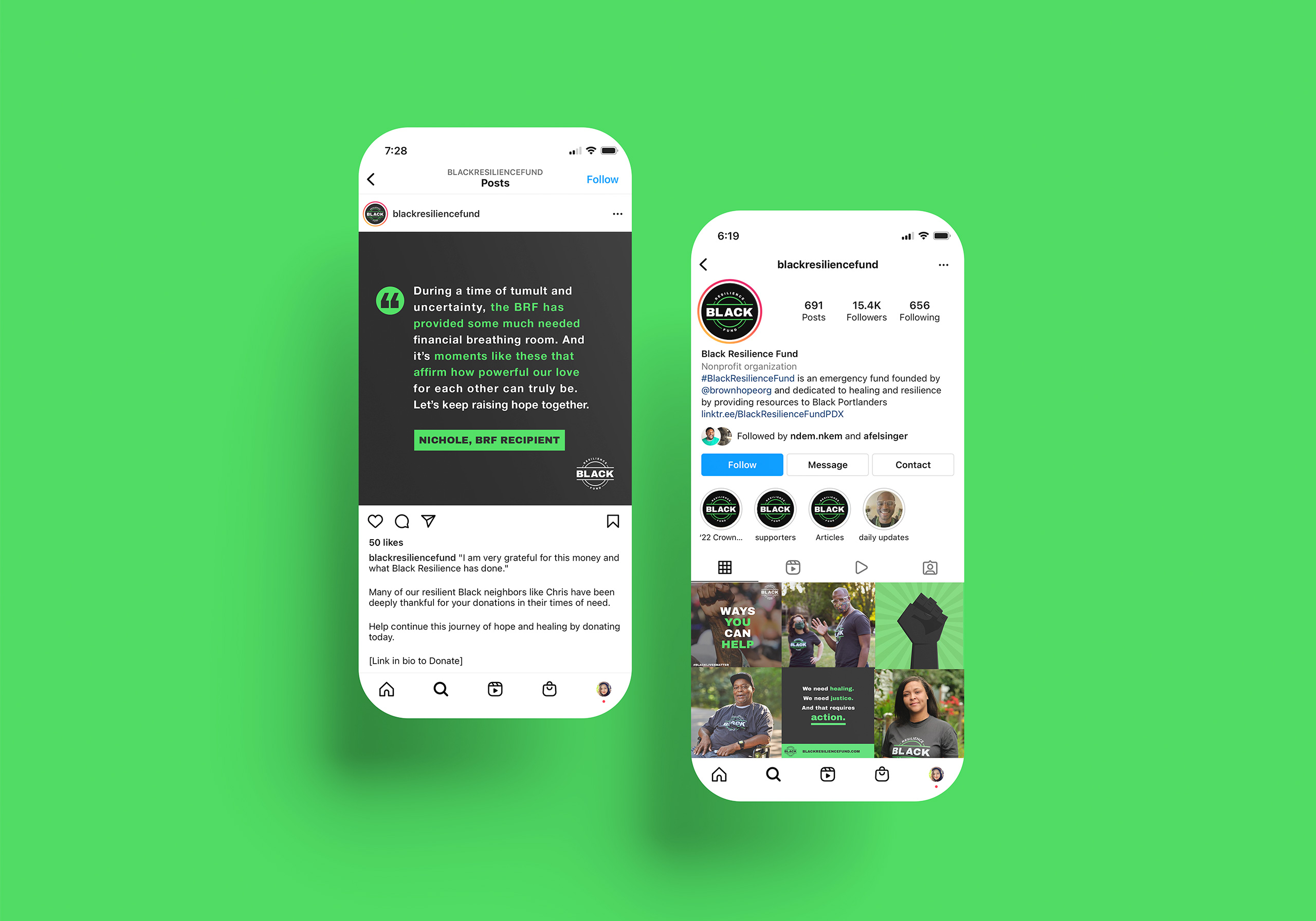
Black Resilience Fund is dedicated to fostering healing and resilience by providing immediate and direct financial assistance to Black Portlanders. The goal is to empower supporters with strong visuals to donate, promote, and contribute to the cause.
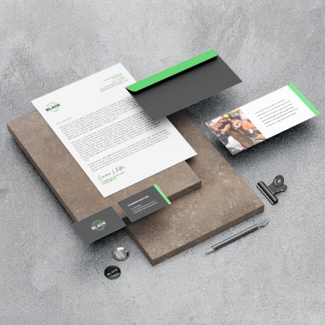
The logo centers the word “black”, representing black people, with “resilience fund” written in a circle to reference the funds encircling them, providing comfort and assistance. The round, double-lined shape is reminiscent of coins, and provides feelings of warmth, protection, and unity. Bold typefaces were used to convey strength against the fight for racial justice. Vibrant green, one of the primary colors, represents money and financial safety. It’s also a color associated with both healing and energy.

Kenas Home
Role: Branding | Concept | Design
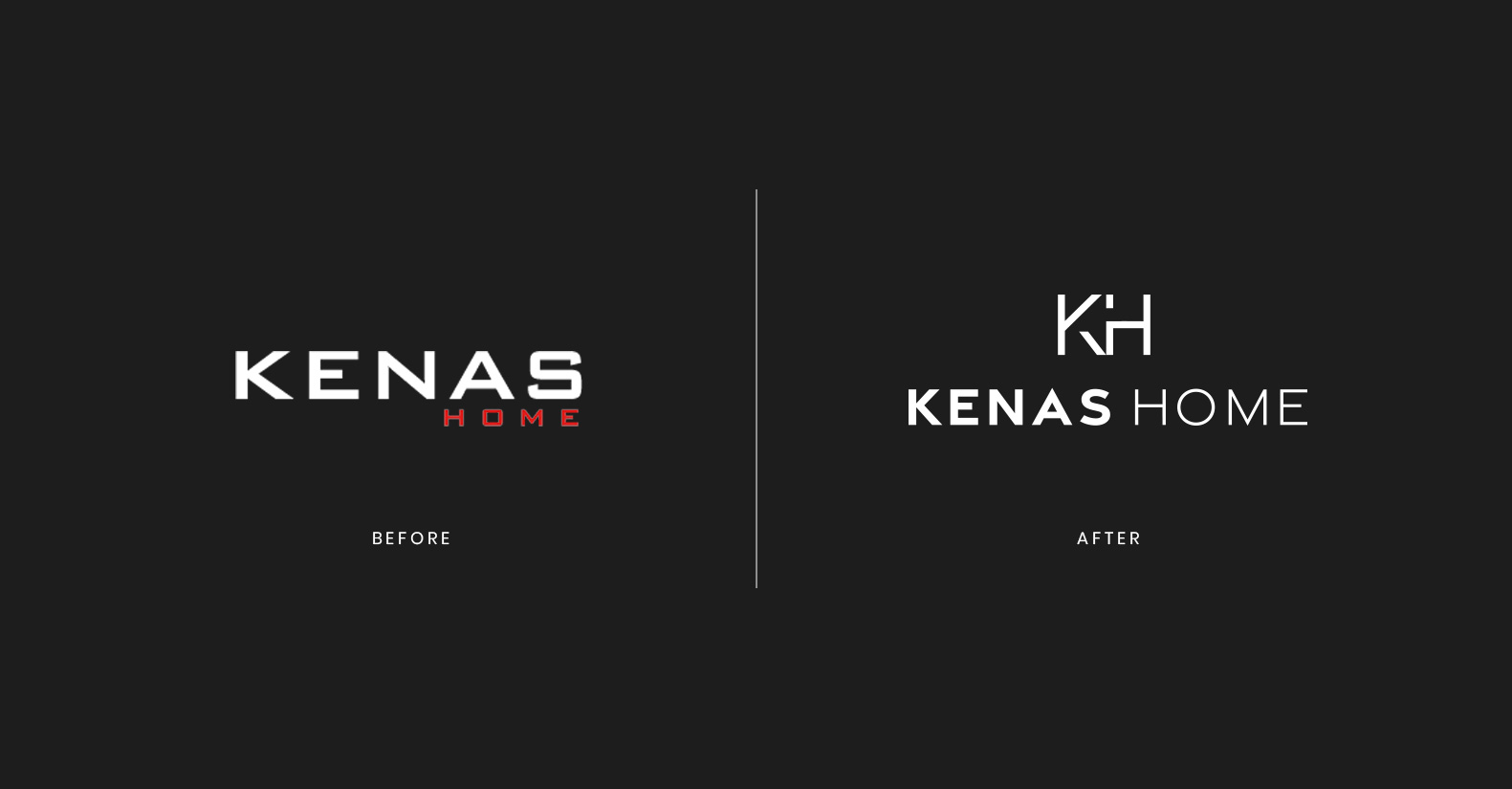
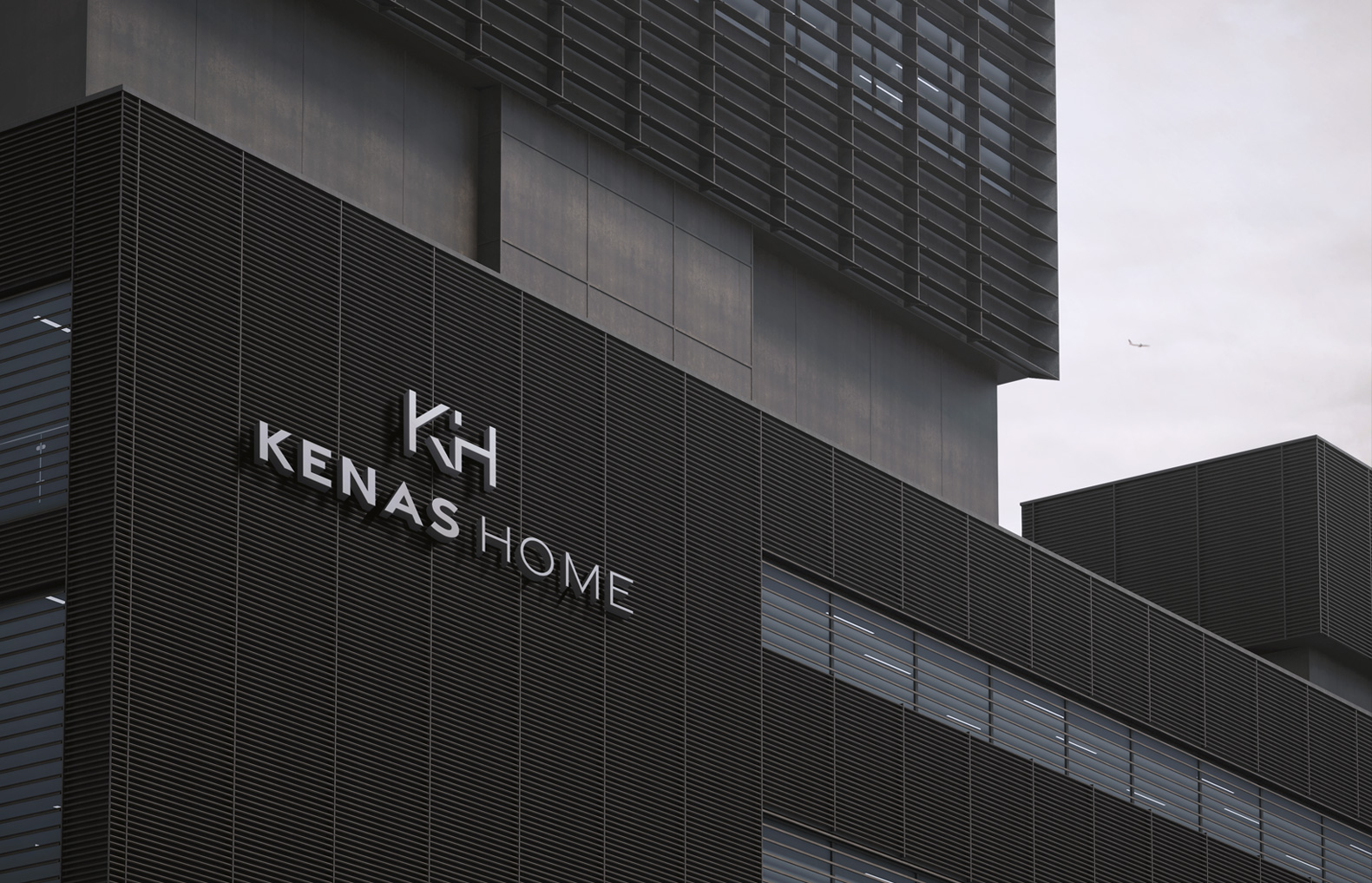
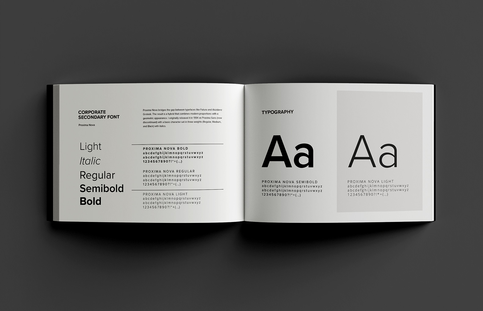
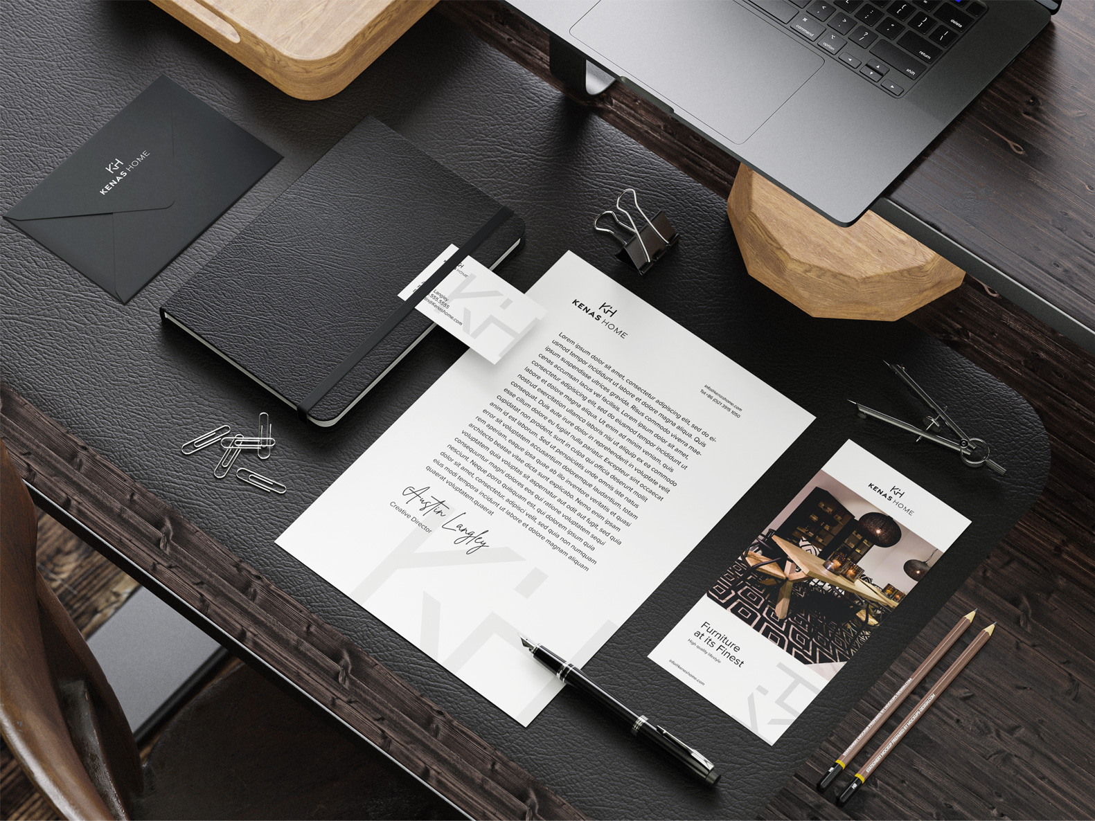
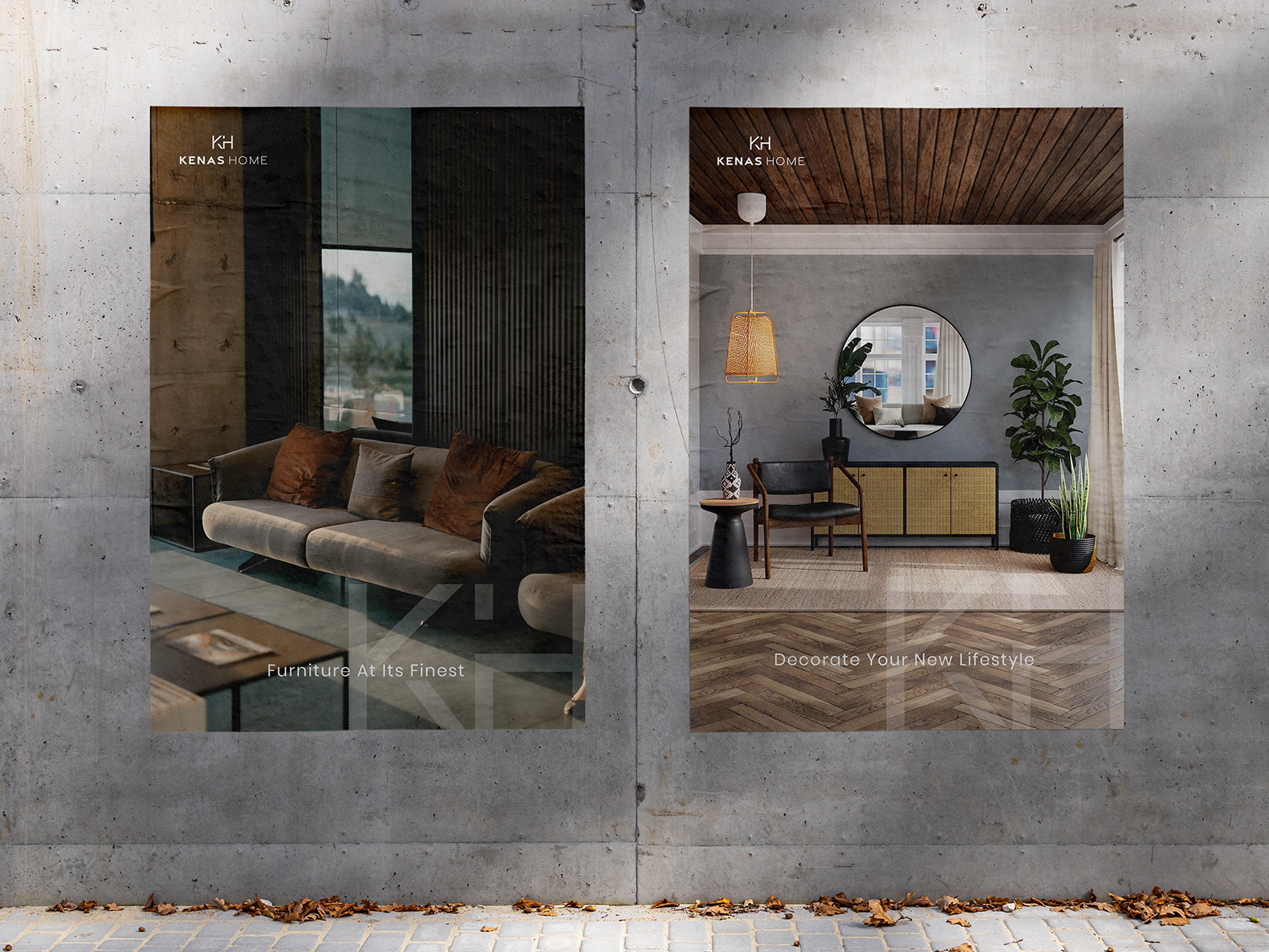
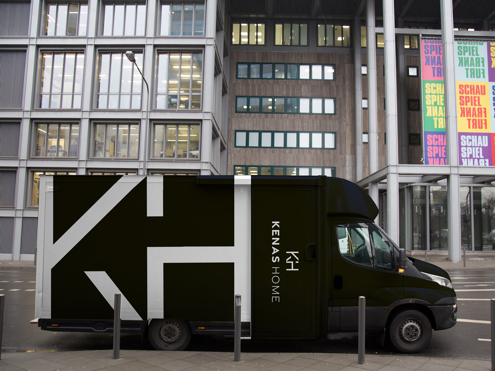
Kenas Home is a branch of Living Style Group, a billion-dollar global design and manufacturing company for high-end decors and furniture. They wanted a rebrand that reflects their commitment to delivering elegant, high-end, sophisticated, and fashion-forward designs. I worked with them to develop a cohesive identity system that aligns with their brand attributes, and establish their positioning as a premium service provider for furnitures and decors.
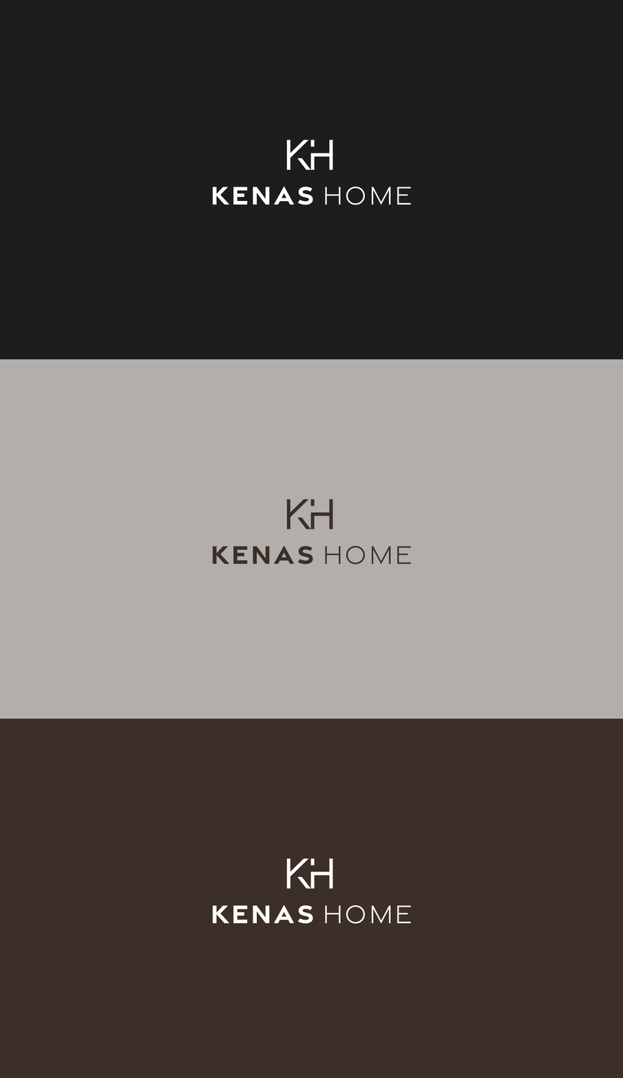
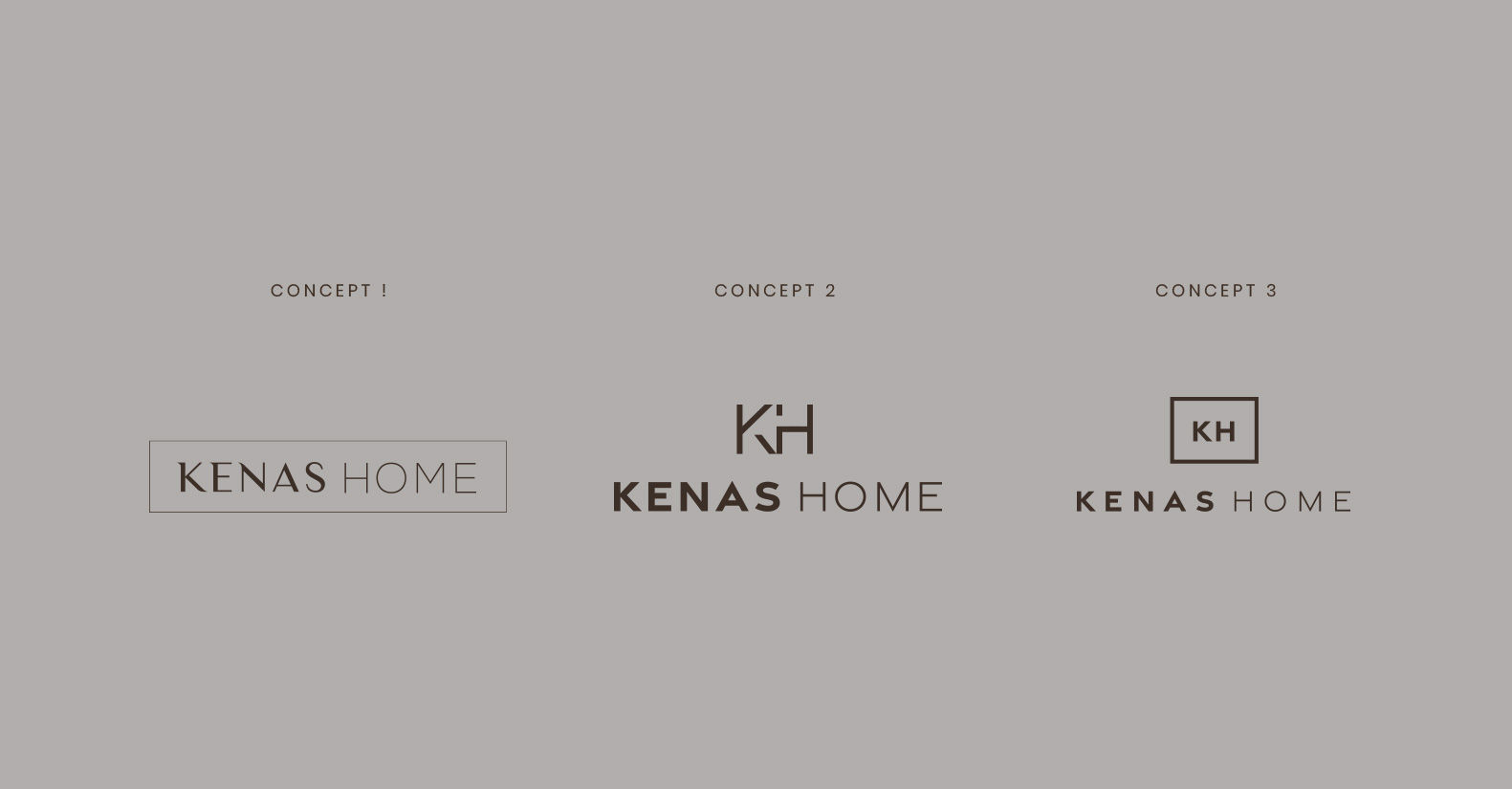
Kenas Home entrusted me with a lot of creative freedom exploring various typographic treatments, marks, and styles as long as the logo exemplifies their brand values. The initial stage of concepting consisted of 25 thumbnail variations, then nailing down to three logo concepts before deciding on the final logo.
Kenas Home
Role: Branding | Concept | Design
Kenas Home is a branch of Living Style Group, a billion-dollar global design and manufacturing company for high-end decors and furniture. They wanted a rebrand that reflects their commitment to delivering elegant, high-end, sophisticated, and fashion-forward designs. I worked with them to develop a cohesive identity system that aligns with their brand attributes, and establish their positioning as a premium service provider for furnitures and decors.

Kenas Home entrusted me with a lot of creative freedom exploring various typographic treatments, marks, and styles as long as the logo exemplifies their brand values. The initial stage of concepting consisted of 25 thumbnail variations, then nailing down to three logo concepts before deciding on the final logo.


Black Resilience Fund
Black Resilience Fund is dedicated to fostering healing and resilience by providing immediate and direct financial assistance to Black Portlanders. The goal is to empower supporters with strong visuals to donate, promote, and contribute to the cause.
The logo centers the word “black”, representing black people, with “resilience fund” written in a circle to reference the funds encircling them, providing comfort and assistance. The round, double-lined shape is reminiscent of coins, and provides feelings of warmth, protection, and unity. Bold typefaces were used to convey strength against the fight for racial justice. Vibrant green, one of the primary colors, represents money and financial safety. It’s also a color associated with both healing and energy.


Asha Farm Sanctuary
Role: Branding | Concept | Design | Illustration
“Asha is hope in action as we work towards a compassionate future for animals.” Asha Farm Sanctuary was formed after our client’s dog, Asha, passed away. The loss inspired her to make a difference in animals’ lives, and give others a chance to make a connection between pets and farmed animals. Our client sought to give an inviting experience to families with young kids as they would be participating in many activities on the farm.
Our goal was to appeal to children with a storybook feel that is intimate, warm, and family-oriented. I redesigned the logo, illustrated the hero image referencing the real sanctuary, designed the stationery, and built the website on Weebly as that was the preferred platform the client had familiarity with.


Aegle Medical
Marketing
Agency
Lindsay and I had worked together previously for Obagi. When she started her new consulting agency with partner Coventry, she approached me to design the branding for Aegle Medical Marketing. The agency seeks to assist physicians in the beauty space with everything from marketing, patient acquisition to cross selling services. The brand’s vision is to embody femininity, beauty, elegance, and operational excellence.
Aegle’s name means “radiance” or “splendour” either from the beauty of the human body when in good health, or from the honor paid to the medical profession. In Greek mythology, Aegle is the daughter of Asclepius (a hero and god of medicine) and Epione (goddess of soothing).
The circle around the wings in the logo symbolized radiance and the glow of beautiful, healthy skin. The wings are like those of a Greek goddess. Gold colors were used to represent operational excellence, and purple for femininity and a deluxe experience.


Our Honor
Role: Brand Development | Concept | Design
Our Honor is a nonprofit veterinary organization that aims to create an organized network of professionals to challenge unethical institutionalized systems and amplify the voices of those who have been marginalized. The concept for the logo conveys Our Honor’s mission to forge alliances with industry to help protect both pets and test animals. The two forms merge into one as one mission.


Expanded CIrcle Collective
Role: Art Direction | Branding | Concept | Design
Animator: Thomas Van Den Heuvel
Any nonprofit organization that wants to thrive needs excellent marketing and engaging visual content. That’s where Expanded Circle Collective steps in offering creative solutions to small grassroots nonprofits that otherwise couldn’t afford the large expense of a branding overhaul. As the Lead Designer, I was tasked with creating our brand. Our strategy was to appeal to activists, the name “Expanded Circle” meant expanding outreach efforts through impactful branding. The two Cs in the logo widen and enlarge like expanding circles. The use of red and black evoke feelings of importance, passion, and aggressiveness in activism work. I also chose a modernized version of the Swiss style for its emphasis on simplicity and purpose where “form follows function.” Something we strive to achieve in our work.


Multicultural Veterinary Case Study
Role: Brand Development | Concept | Design
MCVMA’s vision is to transform the veterinary profession into one which is inclusive and equitable, where people of underrepresented races and ethnicities are valued and supported in their careers resulting in all communities receiving the benefits of veterinary medicine. MCVMA approached us for a rebrand of their visual identity. They wanted something professional, modern, progressive, and emphasizes on diversity in the veterinary field.


The meaning behind the mark

Brief
The founders of MCVMA started the organization with one mission – to address the diversity issue of the veterinary profession being 90% white. They needed the rebrand of their identity to reflect the progressive change towards a more inclusive veterinary field.
Challenge
MCVMA’s challenge was a lack of a strong and consistent brand presence that could speak to the important work they do for the veterinary field. Without a brand that could position them apart from many other similar veterinary medical associations, they lacked a strong positioning resulting in supporters not being able to easily identify their core mission, which is to address the diversity issue in the veterinary field.
Solution
A discovery meeting was held with various team members of the organization to discuss their visions and goals for the rebrand. However, reaching a unanimous decision among the team members proved to be a challenge due to the diverse opinions regarding the focal points of the logo. Some preferred maintaining elements of the old logo, while others sought a complete overhaul
To address this, an additional team meeting was organized to generate ideas and concepts. Eventually, the client agreed that the primary objective was to convey diversity in the medical field, with an added emphasis on progress. I proposed a concept that wasn’t previously discussed, emphasizing on their acronym MV, which would set the logo apart from other similar brands. With more clarity now, I presented three concepts with descriptions and visuals. After the team review, they came to a consensus that concept 3 was the most successful in depicting their vision.
Impact
MCVMA debutted their new logo with resounding success on social media with many supporters claiming they love both the visual and the meaning behind the logo. MCVMA also saw a dramatic increase in donations after the rebrand.


The logo amongst similar brands


